Solenne
- Shane Wilson
- 7 hours ago
- 1 min read

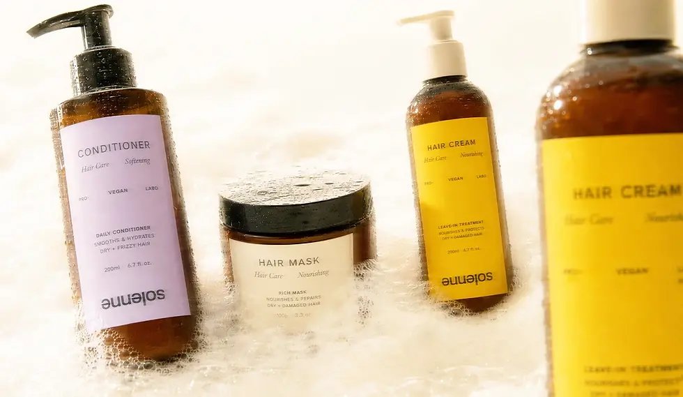
Solenne by Neo studio is a refined skincare and haircare packaging concept that proves minimal design does not have to feel predictable. The labels are clean and restrained, but the system becomes memorable through a subtle shift in hierarchy: the product name and function are placed clearly at the top, while the logo sits upside down near the bottom of the label.
That small disruption gives the packaging a more editorial quality. It keeps the front label easy to understand while creating a visual moment that feels intentional, premium, and slightly unexpected.
The photography strengthens the entire identity. Soft blur, neutral fruit styling, natural backgrounds, and warm atmospheric images help the packaging feel less like a product shot and more like a lifestyle world. The result is calm, clean, and tactile — a skincare and haircare brand system that feels modern without becoming cold.


Fivestar Branding curates global design inspiration to showcase the best in packaging, logo design, and brand identity. Beyond curation, we are a full-service branding agency based in Ellenton, Florida and working worldwide — crafting bold, modern identities that help businesses stand out in competitive markets.