
Solene
- Shane Wilson
- May 21
- 1 min read

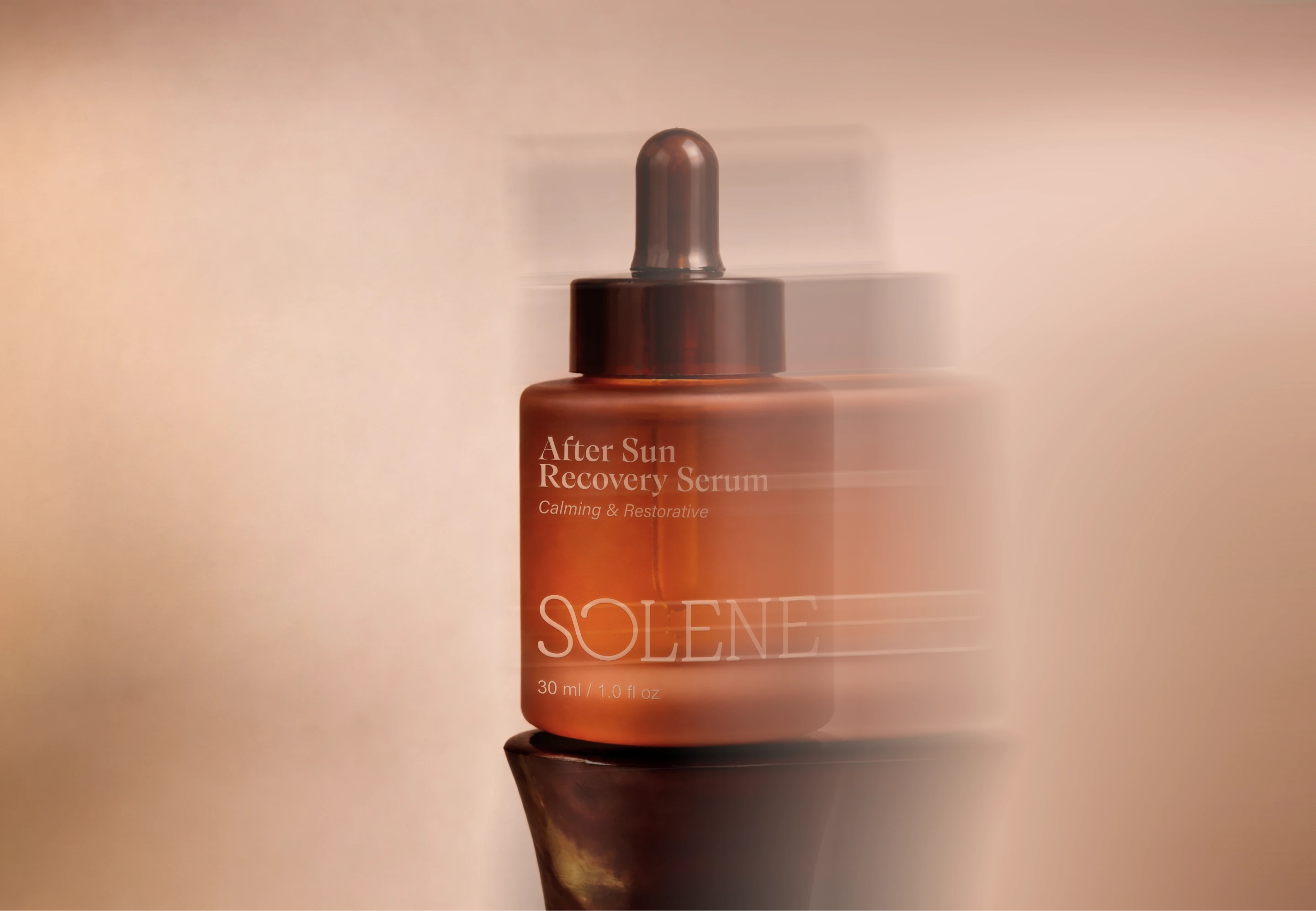
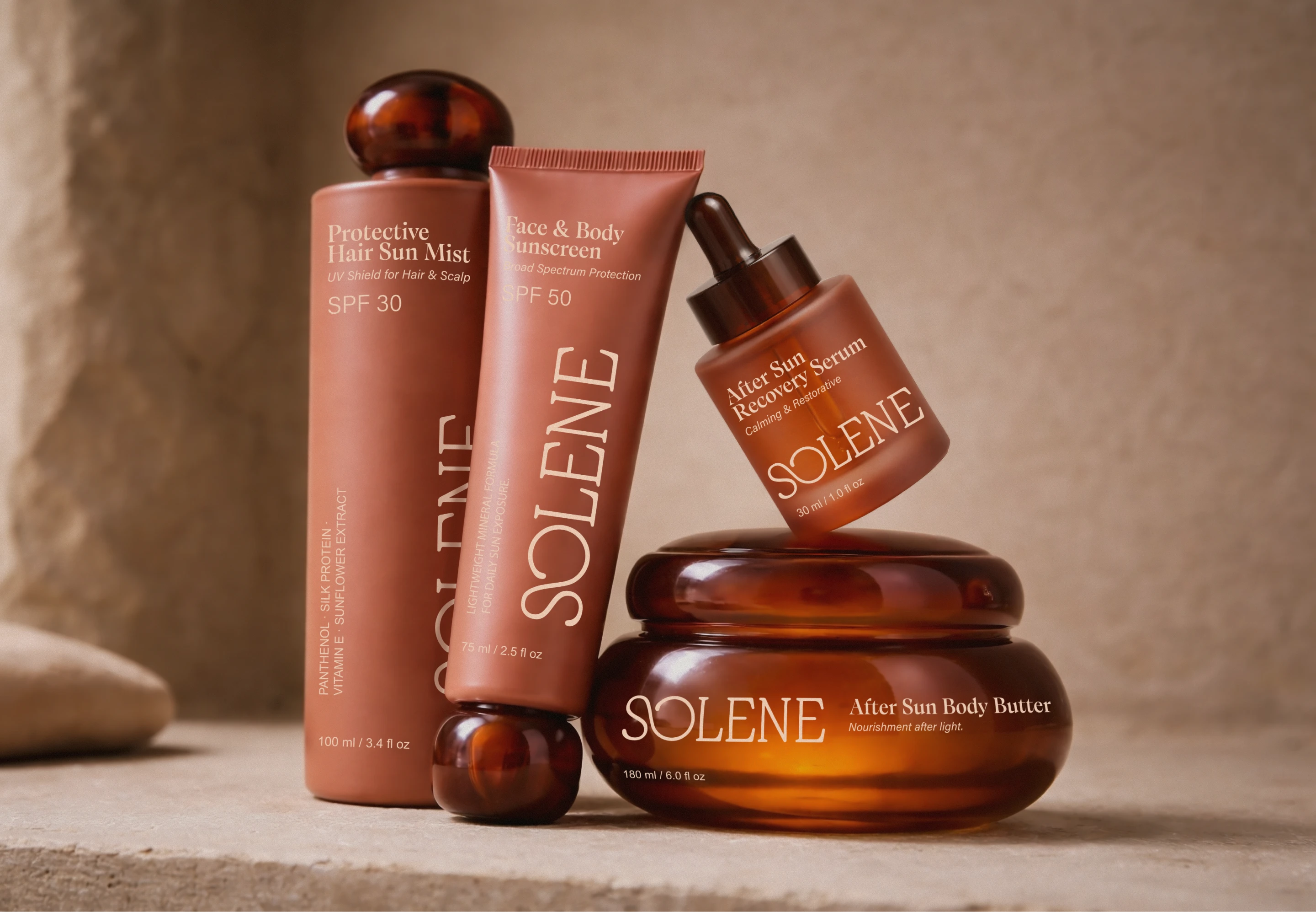
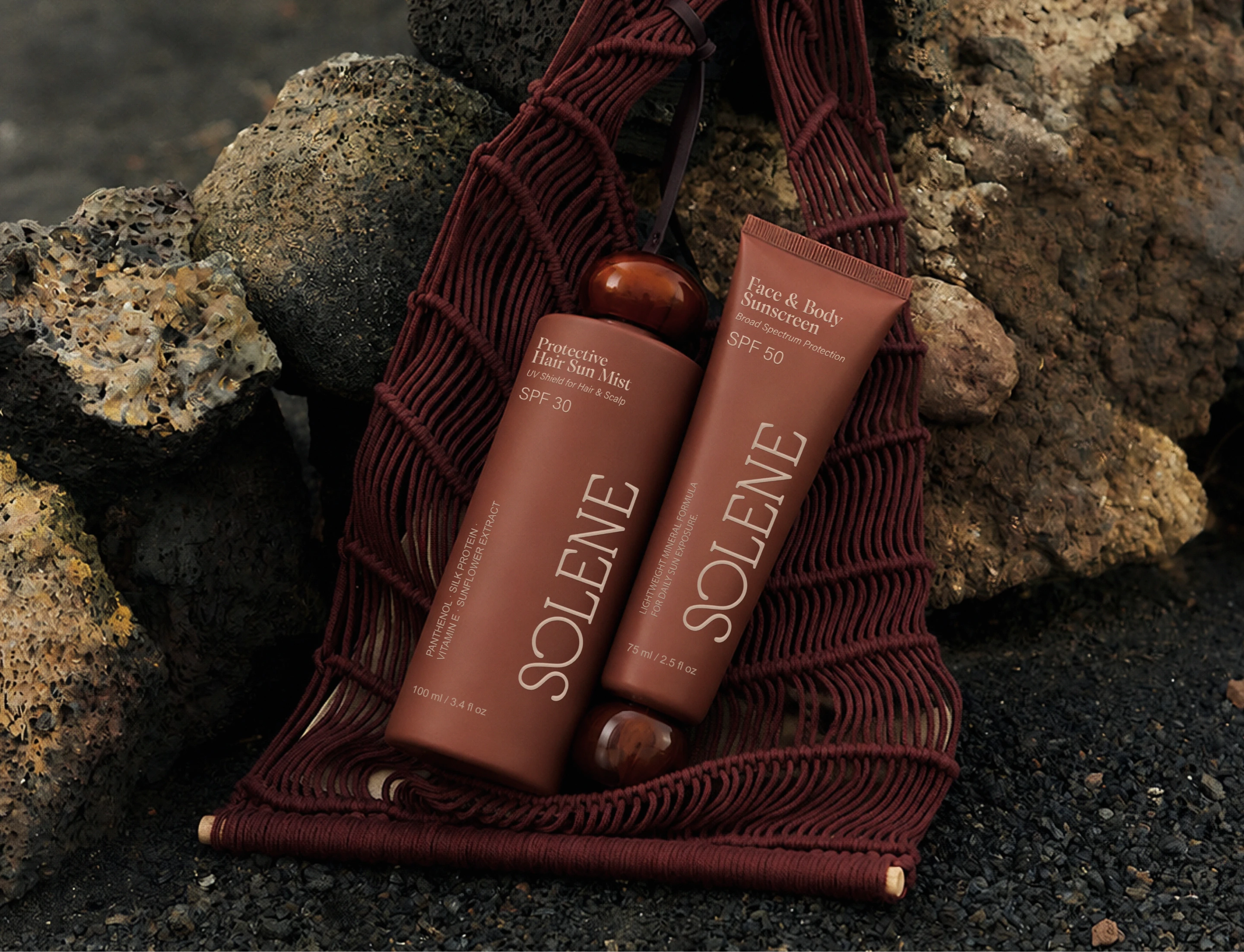
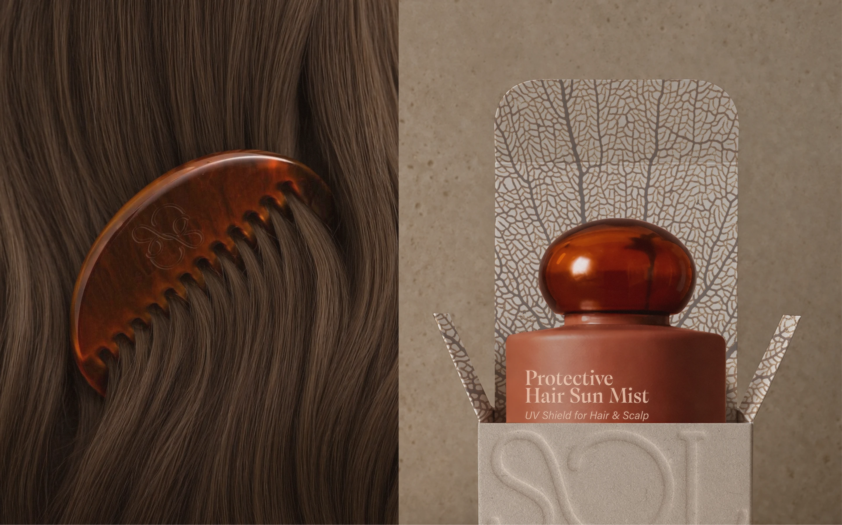
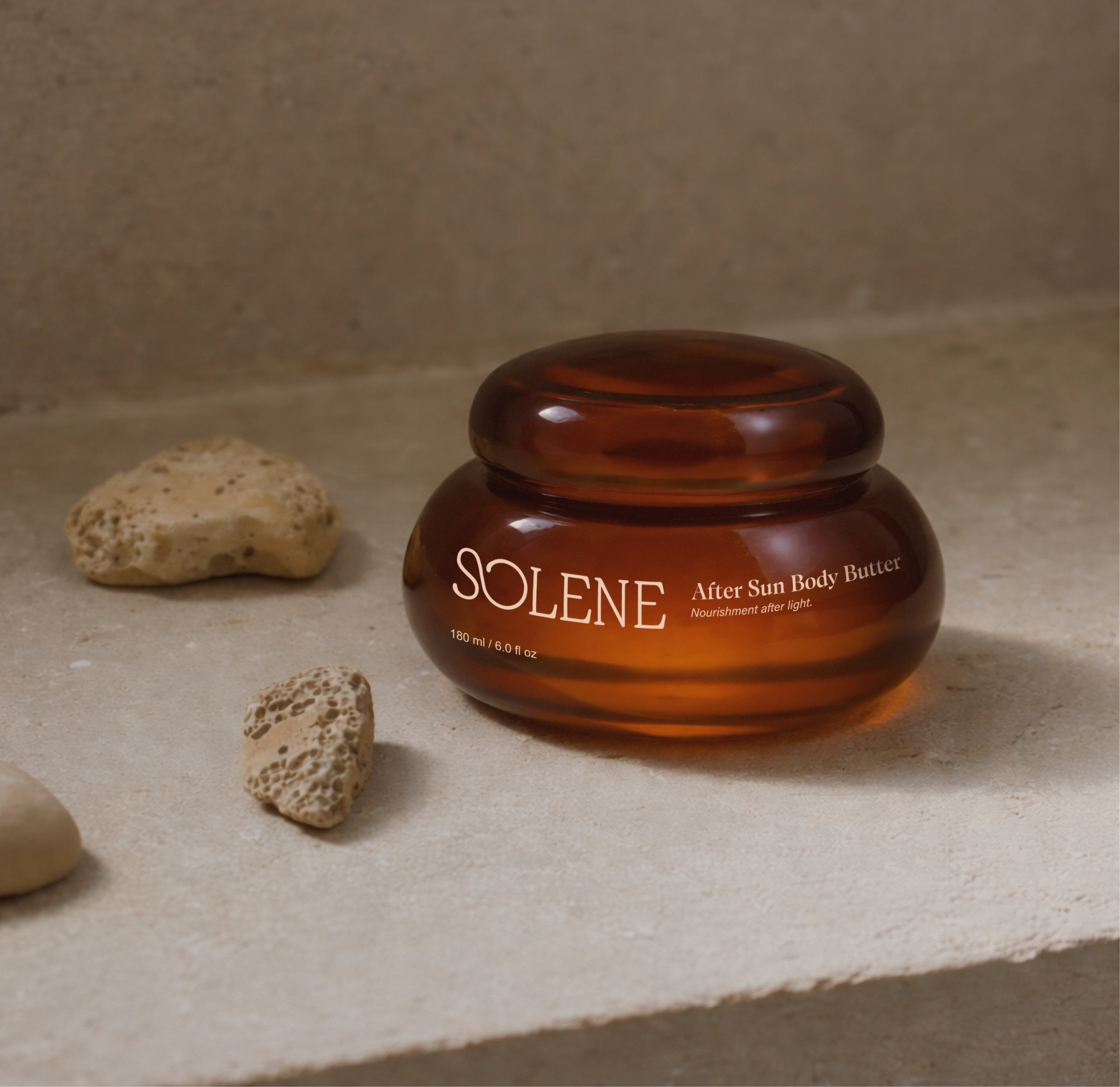
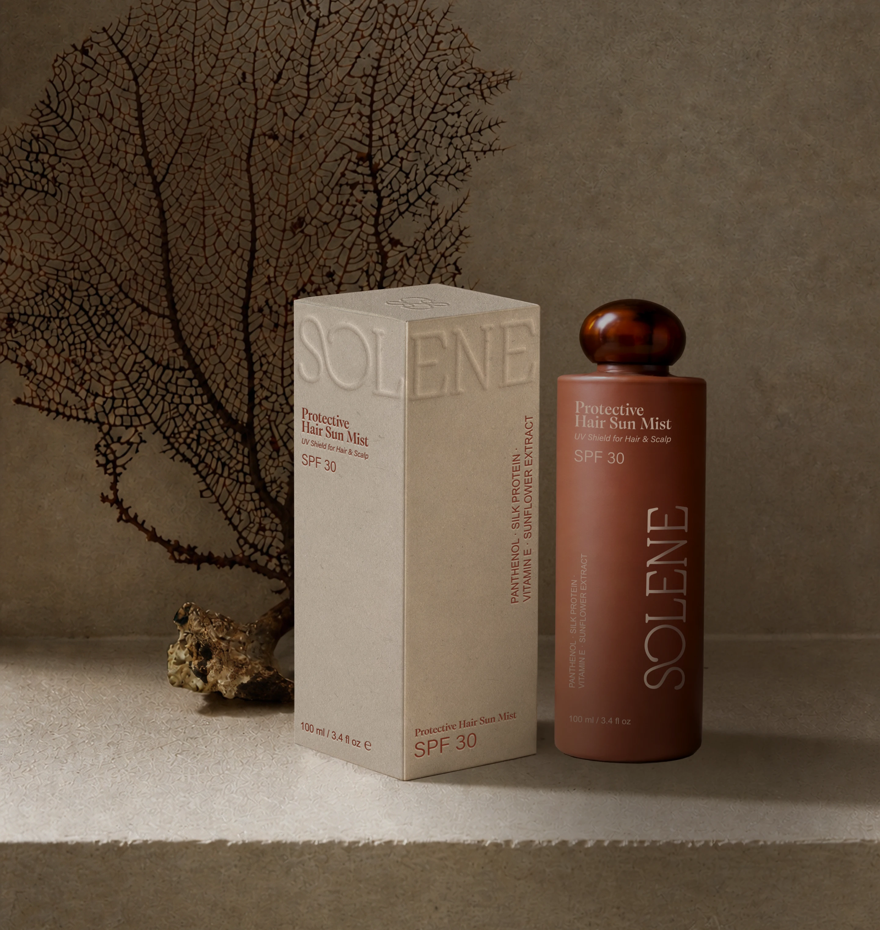
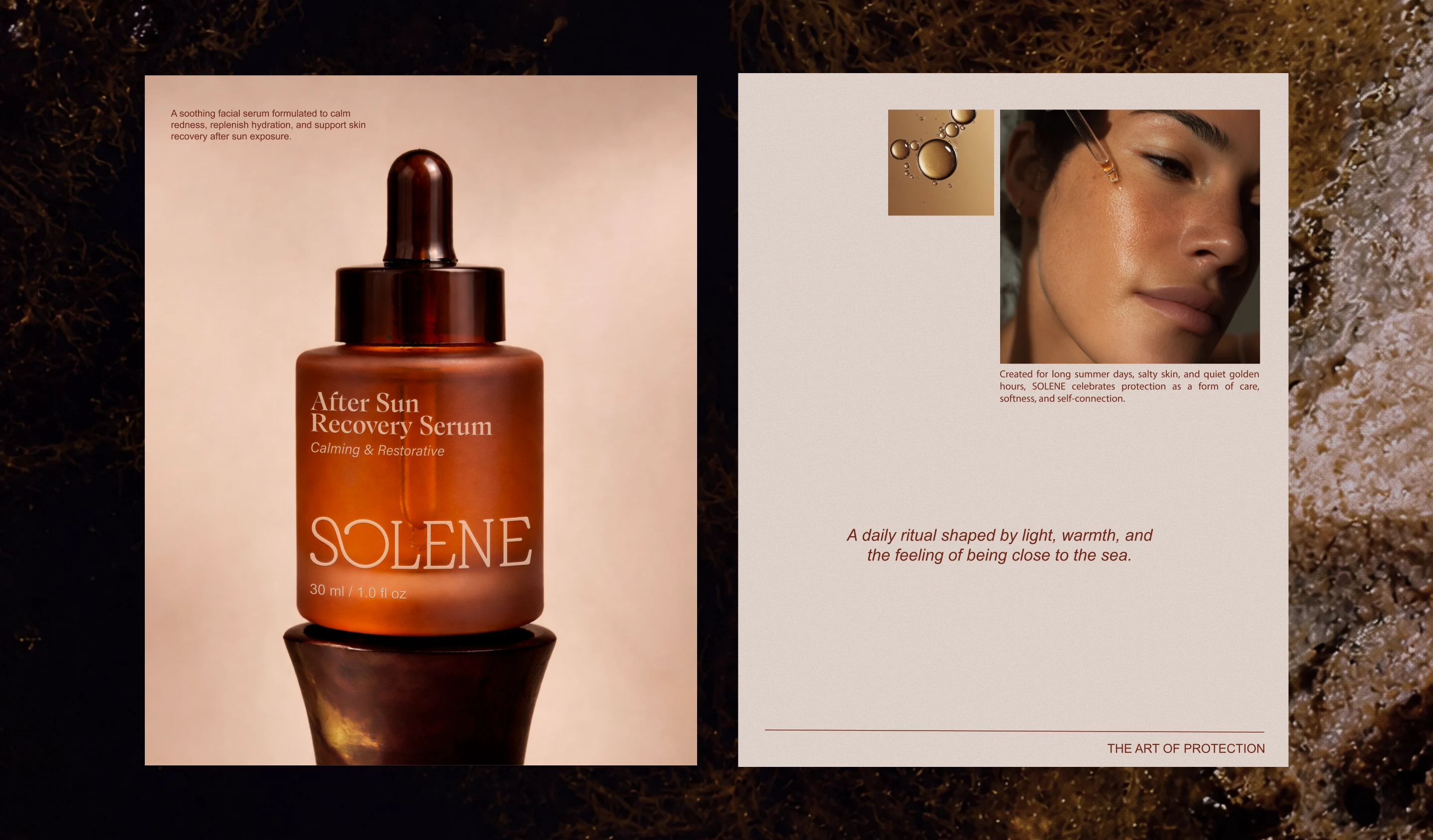
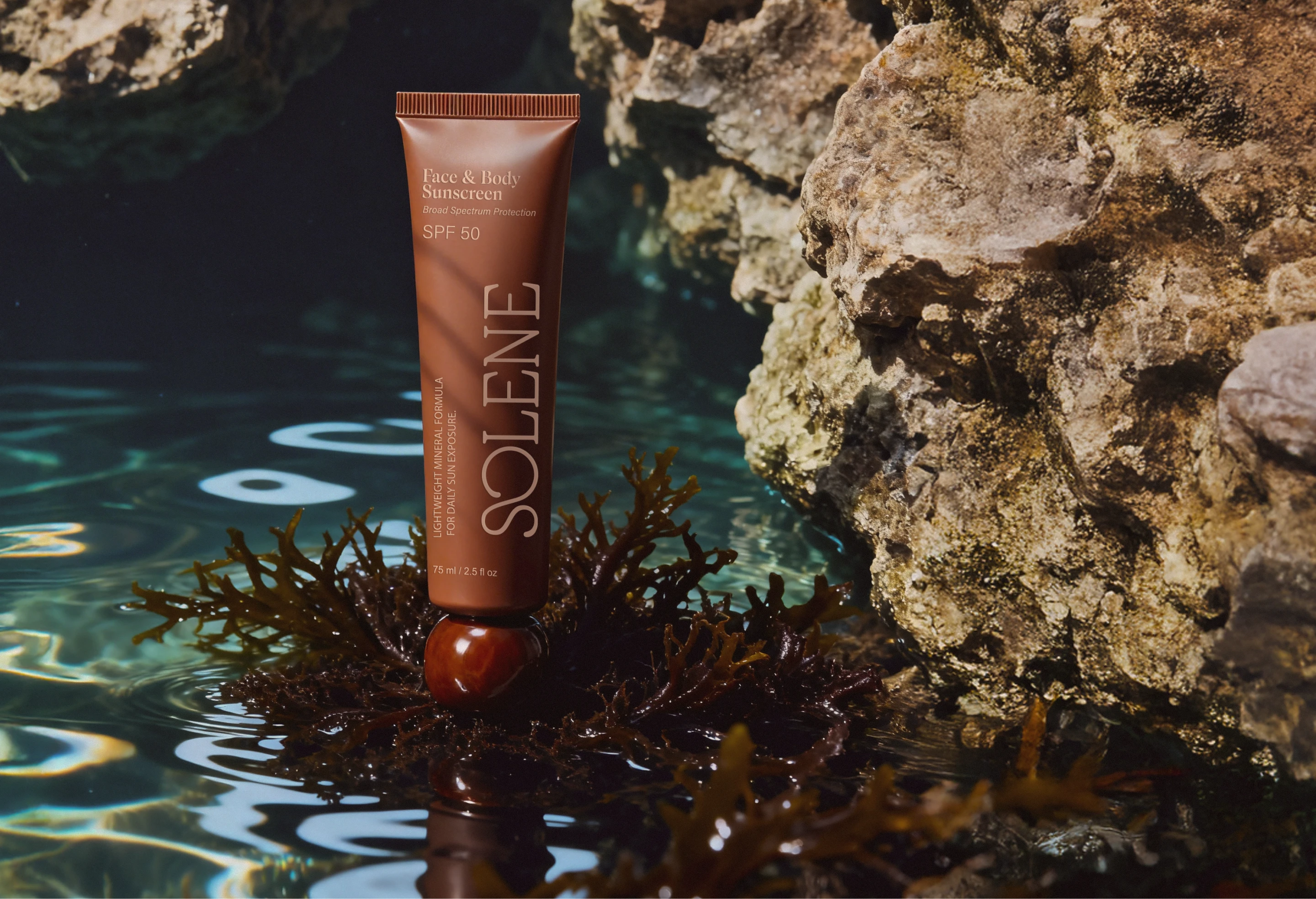
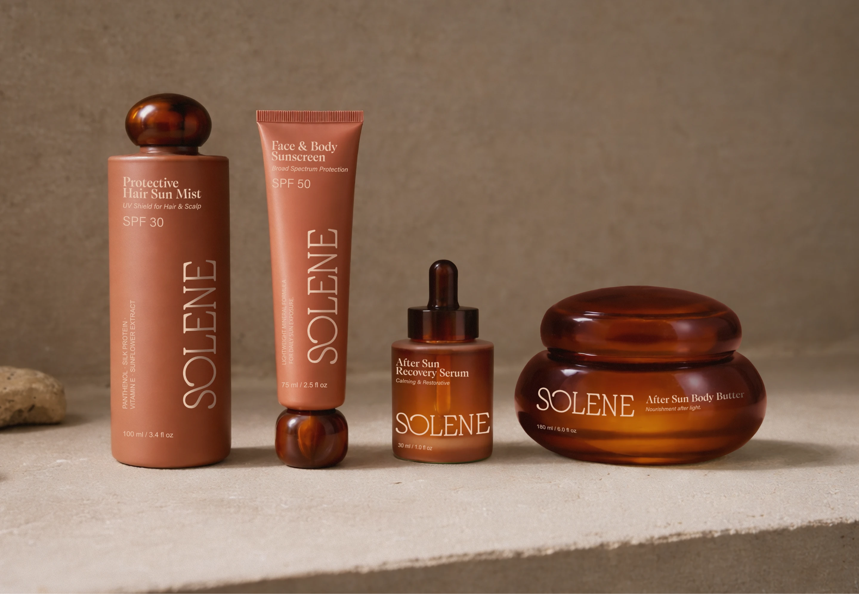
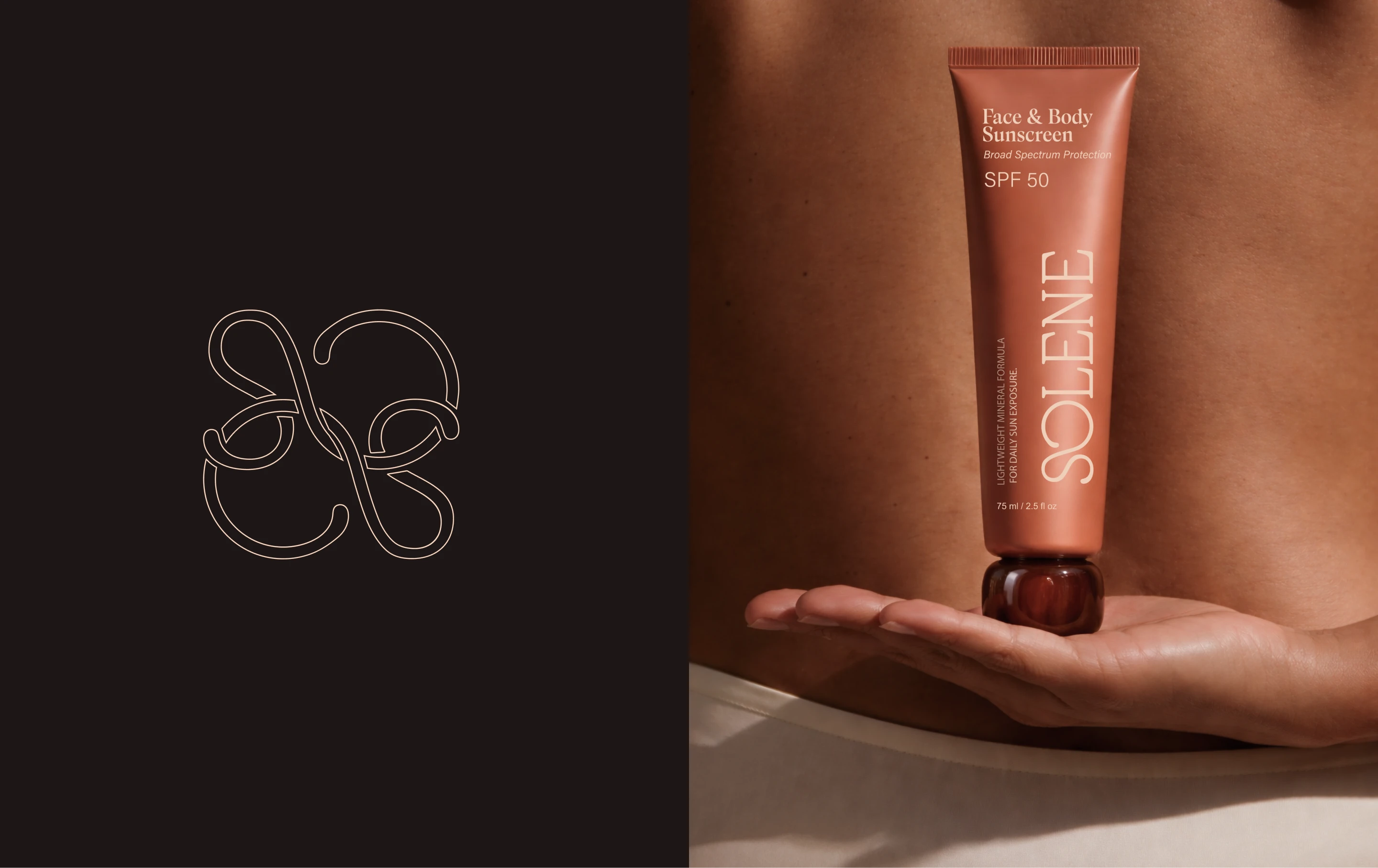
Solene SPF, a sunscreen visual identity by Anastasia Gvildiené, brings a warmer and more refined point of view to sun care packaging. Instead of relying on the usual bright, clinical, or beach-heavy language often seen in SPF branding, the identity leans into amber tones, soft contrast, and tactile material details that make the products feel closer to body care, fragrance, and ritual.
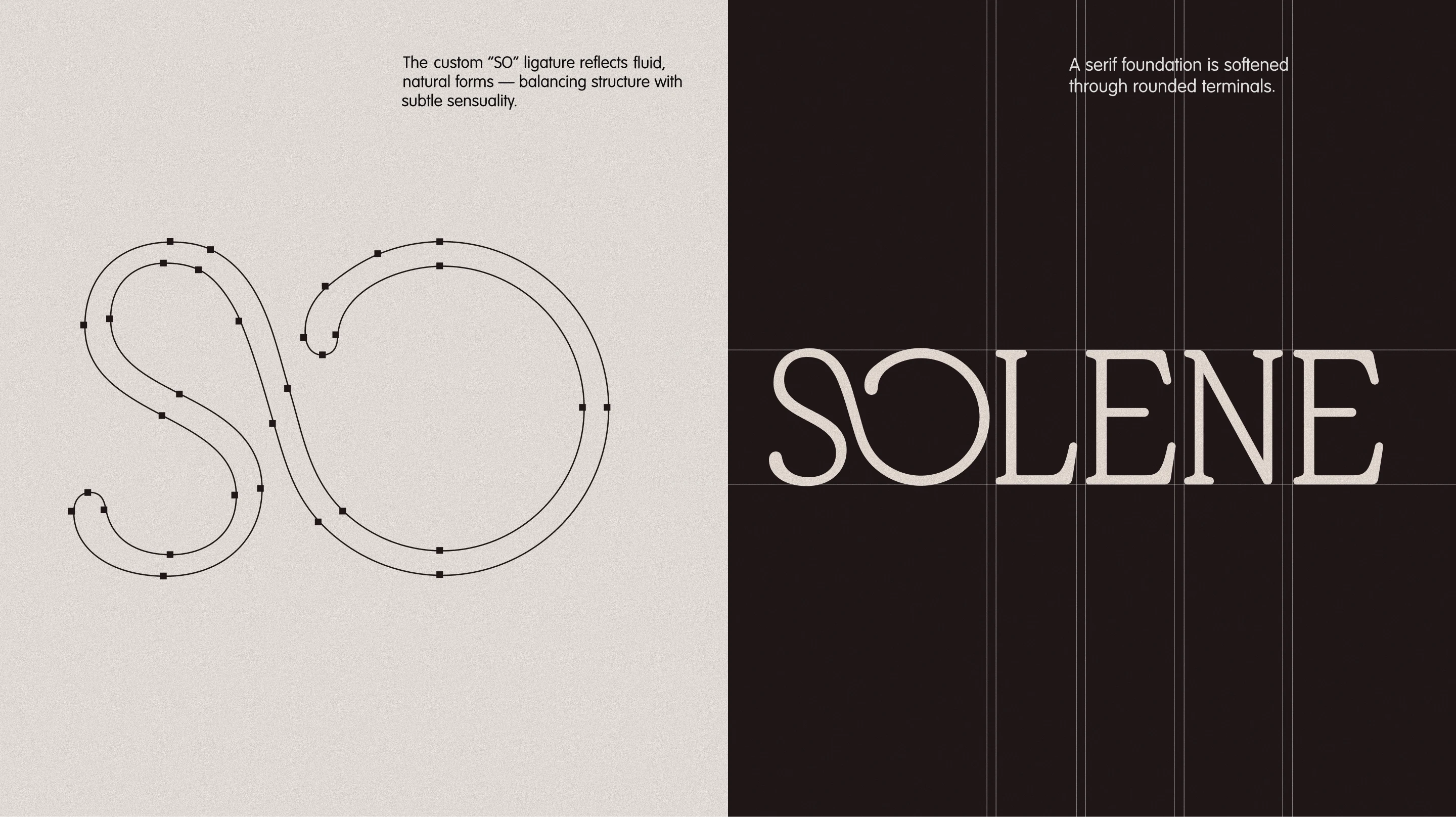
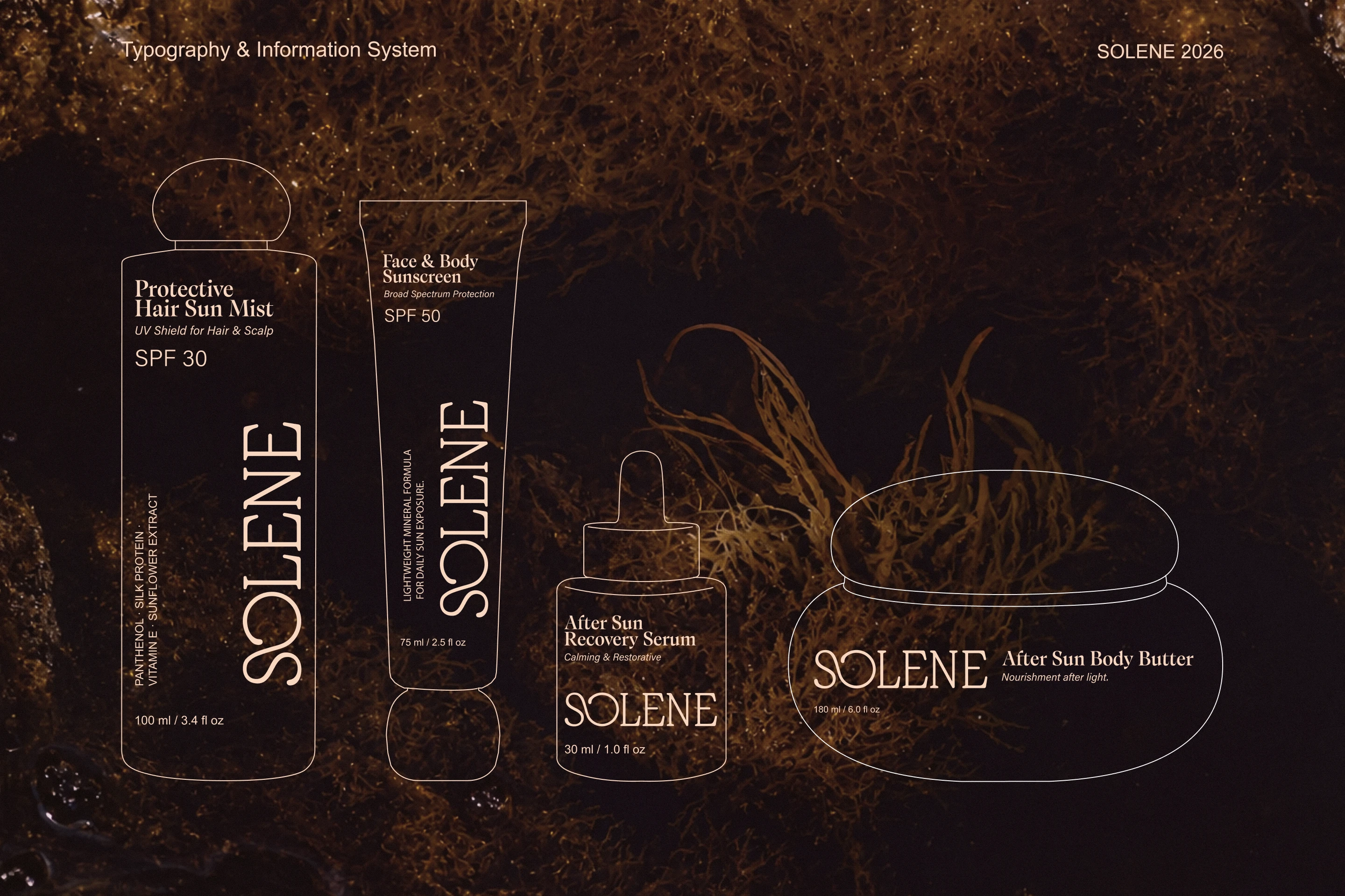
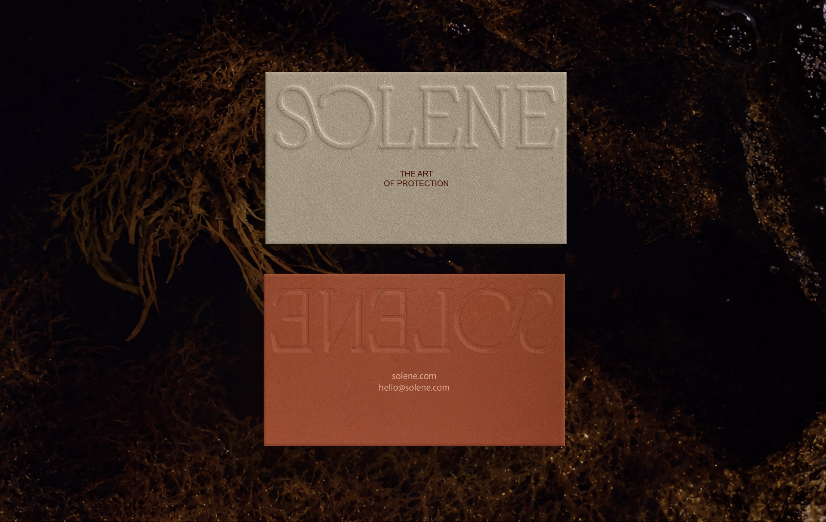
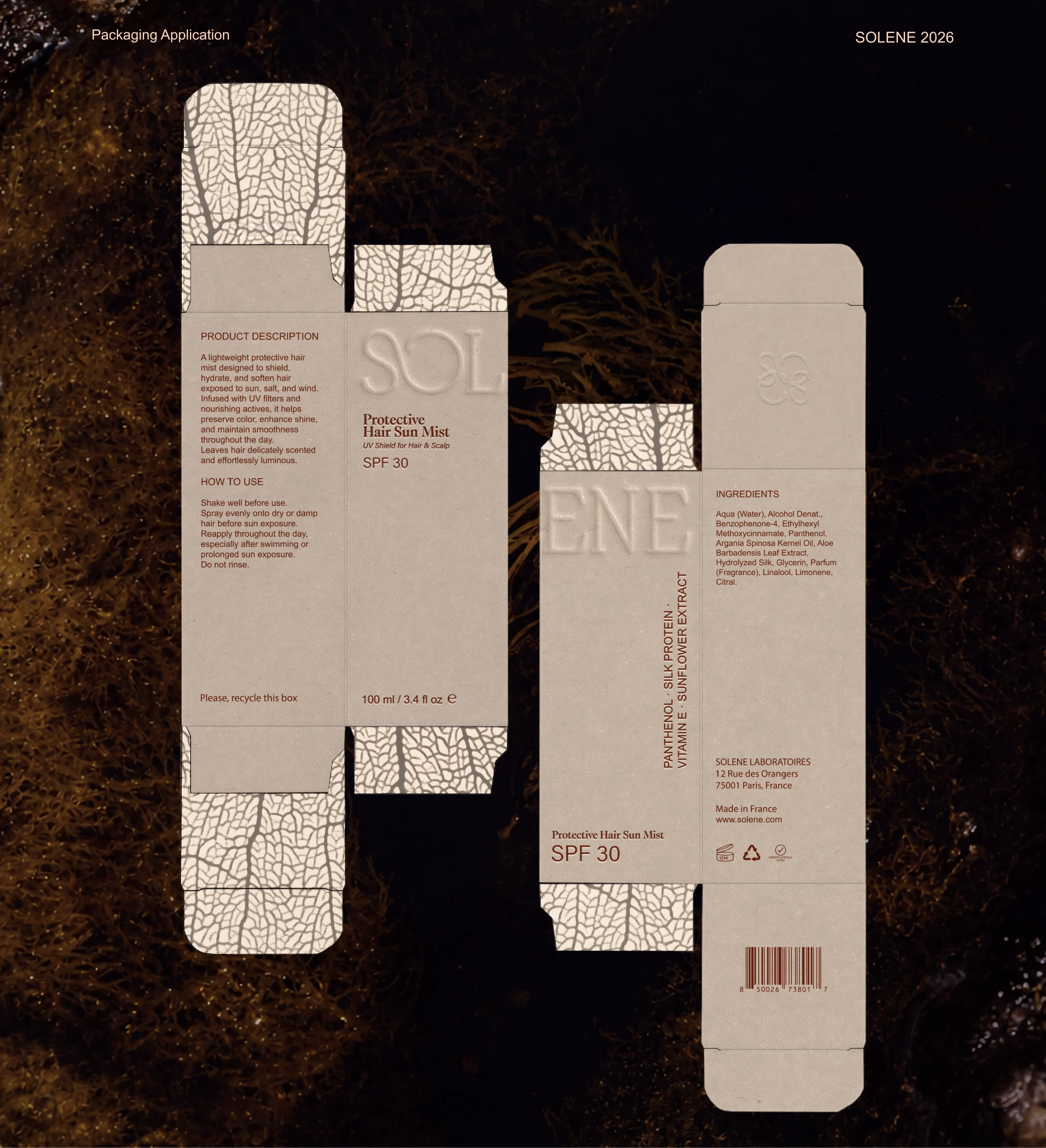
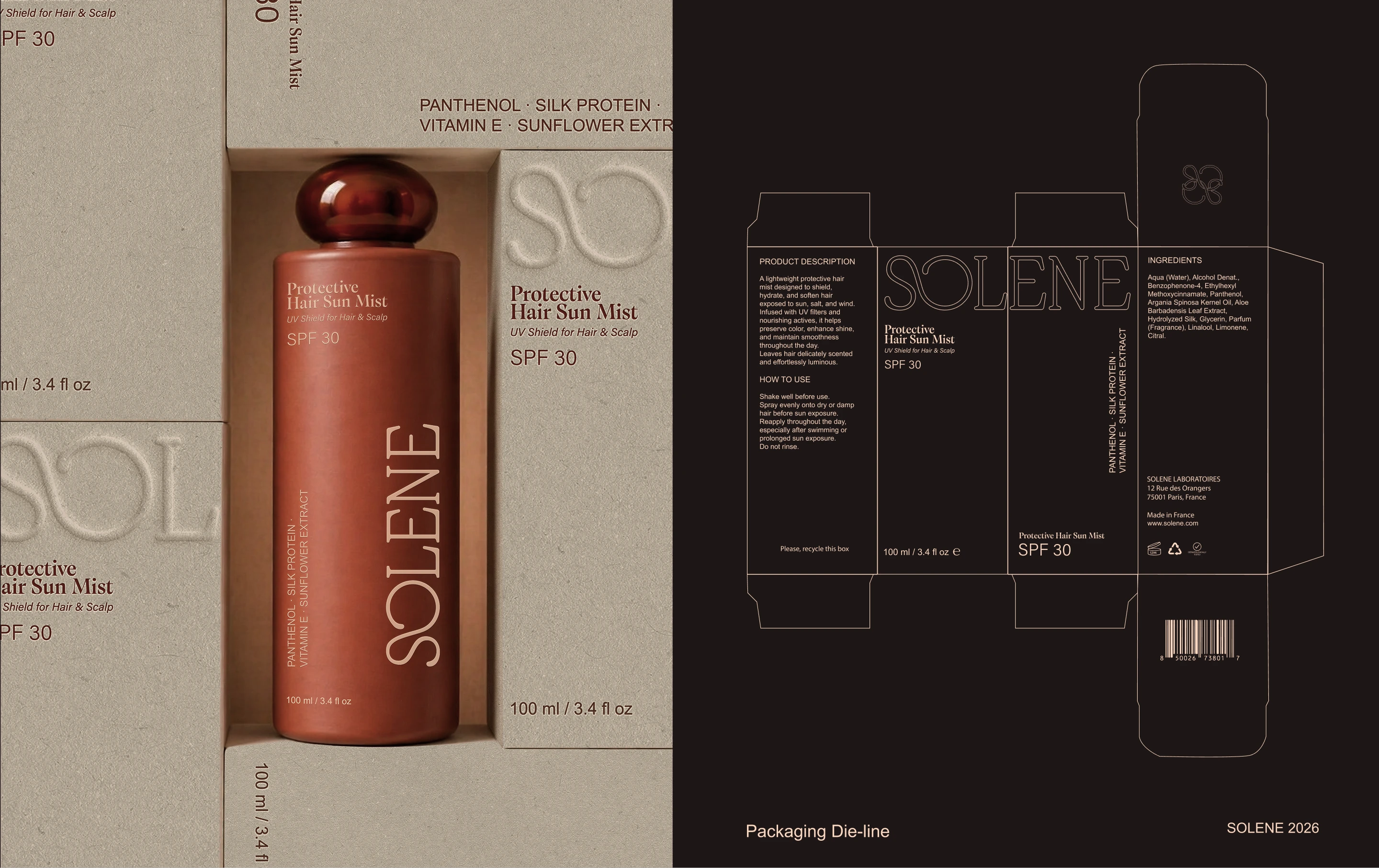
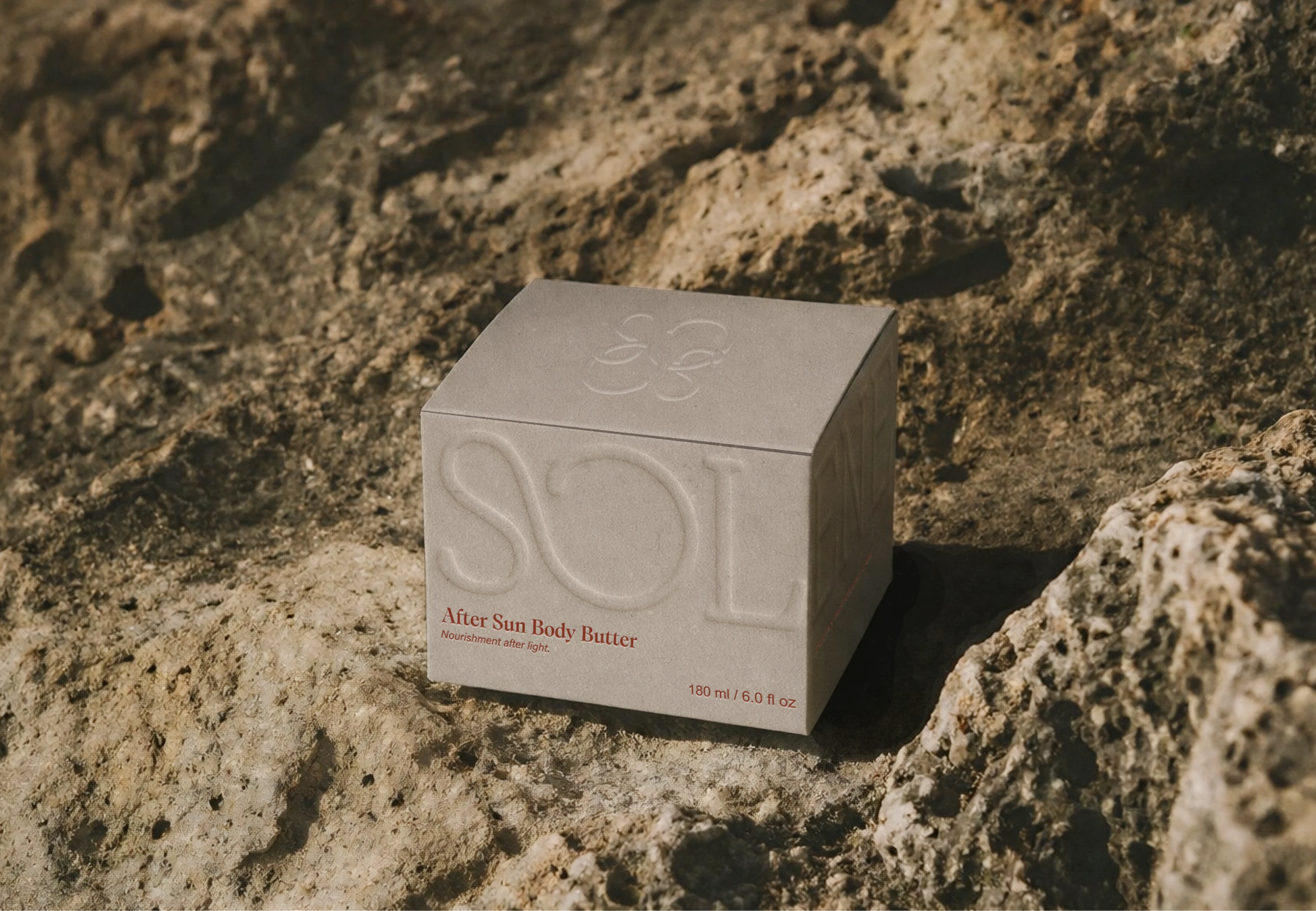
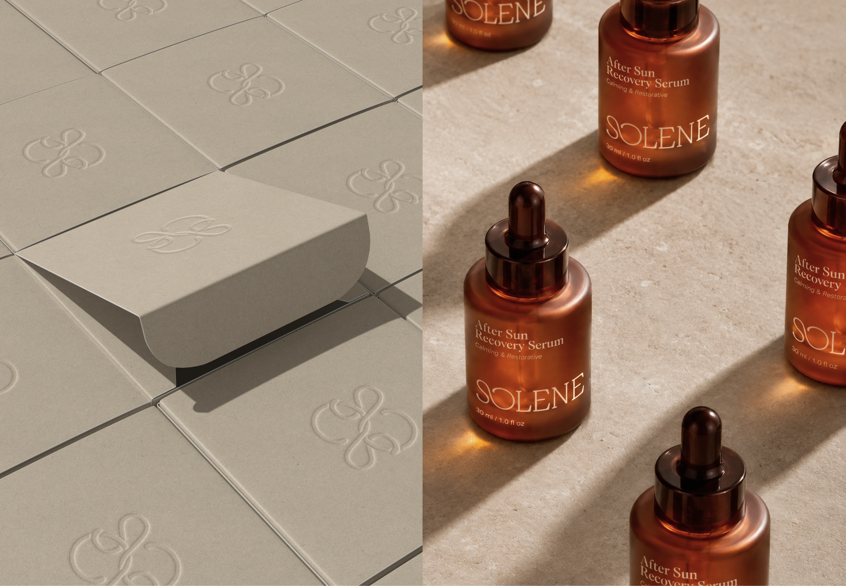
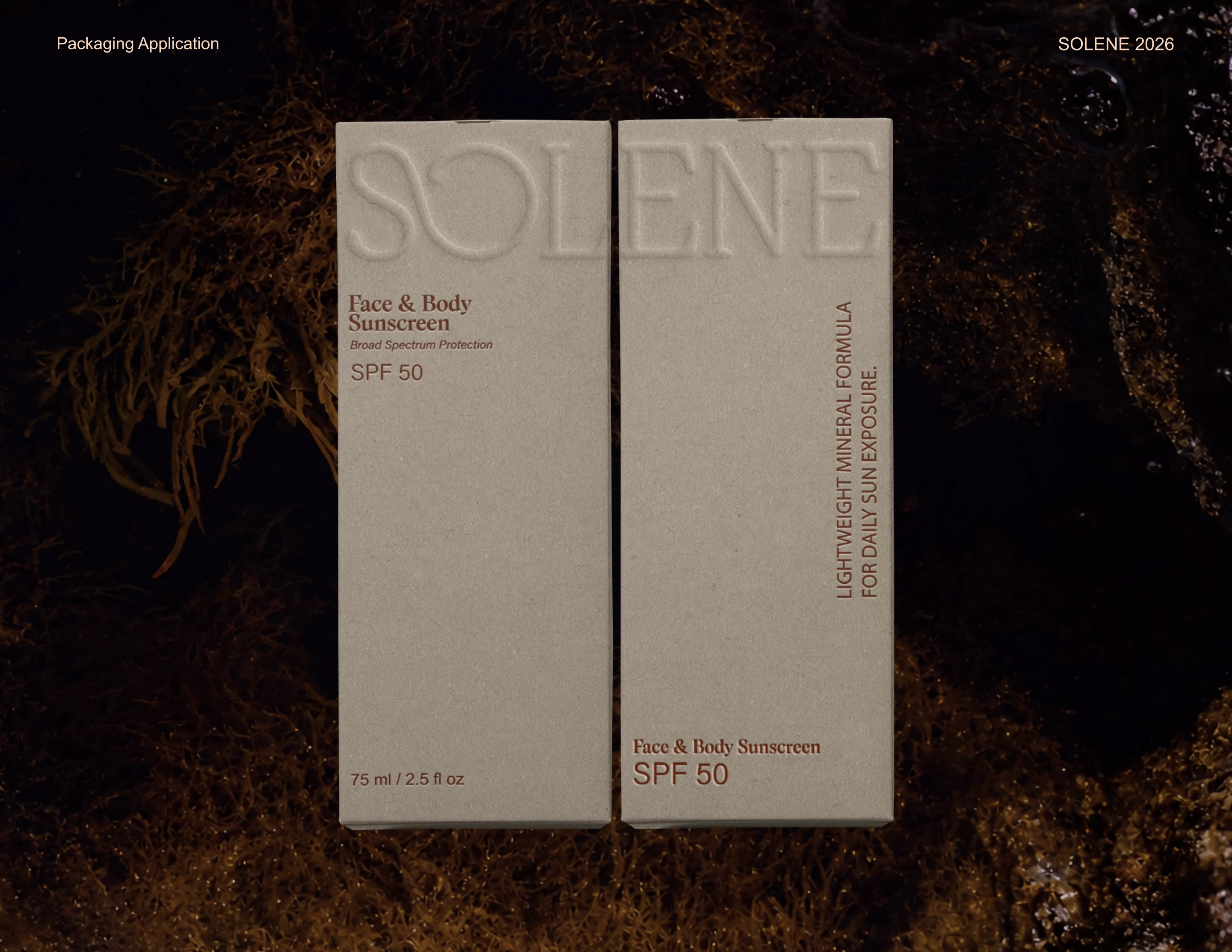
The packaging system works because it balances restraint with atmosphere. The tall vertical wordmark gives the bottles a quiet elegance, while the smaller serif product details create a sense of delicacy and precision. The muted clay, ivory, and amber palette gives the line a natural warmth without becoming rustic. Embossing on the secondary packaging adds a subtle luxury cue, turning a simple box into something more collectible and sensory.
The photography also plays an important role in the brand’s positioning. Stone surfaces, low light, amber reflections, and organic textures help Solene feel grounded and sun-warmed rather than glossy or overproduced. Altogether, the brand identity shows how sunscreen packaging can feel protective, elevated, and emotionally inviting while still communicating clarity across product types.

Fivestar Branding curates global design inspiration to showcase the best in packaging, logo design, and brand identity. Beyond curation, we are a full-service branding agency based in Ellenton, Florida and working worldwide—crafting bold, modern identities that help businesses stand out in competitive markets.


