
Blaire
- Shane Wilson
- 5 days ago
- 1 min read

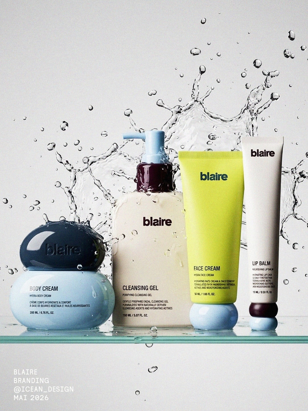
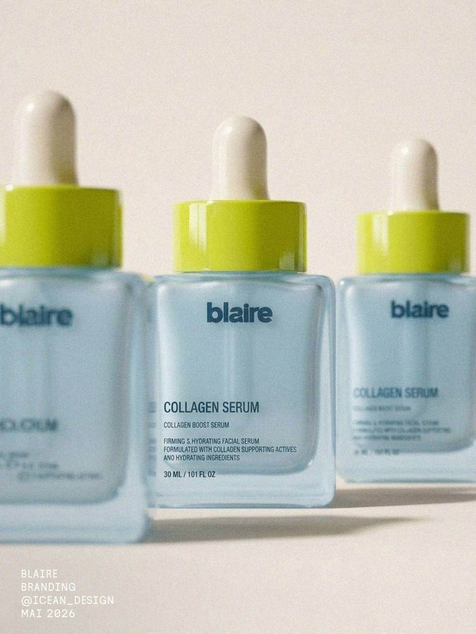
Blaire Skincare Packaging by @icean_design is a playful beauty identity built around soft rounded forms, glossy product shapes, and a fresh color system of powder blue, cream, citrus green, coral, and deep burgundy. The packaging feels clean and youthful without falling into generic “minimal skincare” territory — which is harder than it looks, because skincare branding can get beige real fast.
What makes this concept stand out is the balance between softness and punch. The rounded bottles, bubble-like caps, and tiled bathroom settings give the brand a fresh, tactile quality, while the bold lime accents and chunky typography keep it modern and energetic. It feels designed for a skincare brand that wants to be approachable, visual, and memorable on shelf, online, and across social.
This is a strong reference for beauty brands, skincare packaging, product line systems, playful minimalism, and founders looking for a way to make clean packaging feel distinctive without overcomplicating the design.


Fivestar Branding curates global design inspiration to showcase the best in packaging, logo design, and brand identity. Beyond curation, we are a full-service branding agency based in Ellenton, Florida and working worldwide — crafting bold, modern identities that help businesses stand out in competitive markets.


