
HAY Organics
- Shane Wilson
- May 18
- 1 min read

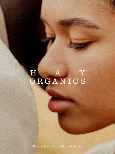
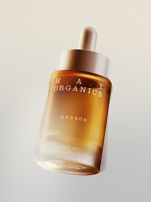
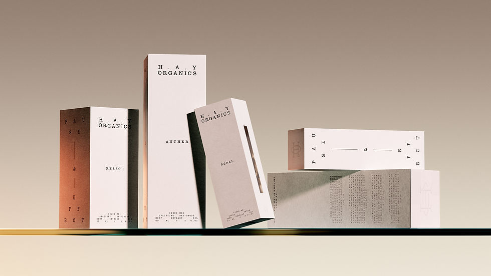
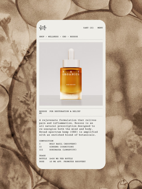
Hay Organics is a wellness brand built around calm, ritual, and plant-based restoration. Designed by Moving Studio, the identity brings the brand into a more premium space through restrained typography, tactile packaging, soft natural tones, and a visual system that feels both medicinal and serene.
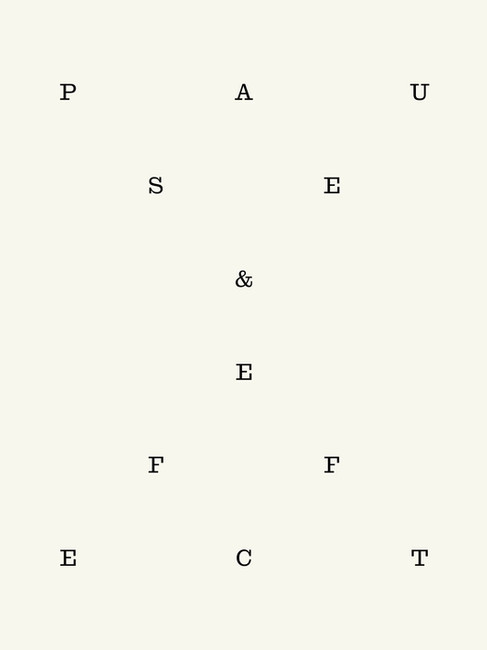
The design leans into a quiet sense of balance. Minimal layouts, generous negative space, delicate type treatments, and FSC paper stocks create a brand world that feels considered rather than overdesigned. Blind embossing, recycled materials, and eco-conscious inks support the brand’s sustainability story without turning the packaging into a loud environmental statement.
What makes this identity work is its restraint. Instead of leaning on the usual wellness clichés, Hay Organics uses atmosphere, materiality, and typographic precision to communicate trust, calm, and elevated natural care.


Fivestar Branding curates global design inspiration to showcase the best in packaging, logo design, and brand identity. Beyond curation, we are a full-service branding agency based in Ellenton, Florida and working worldwide—crafting bold, modern identities that help businesses stand out in competitive markets.


