Fiora
- Shane Wilson
- Aug 7, 2025
- 1 min read
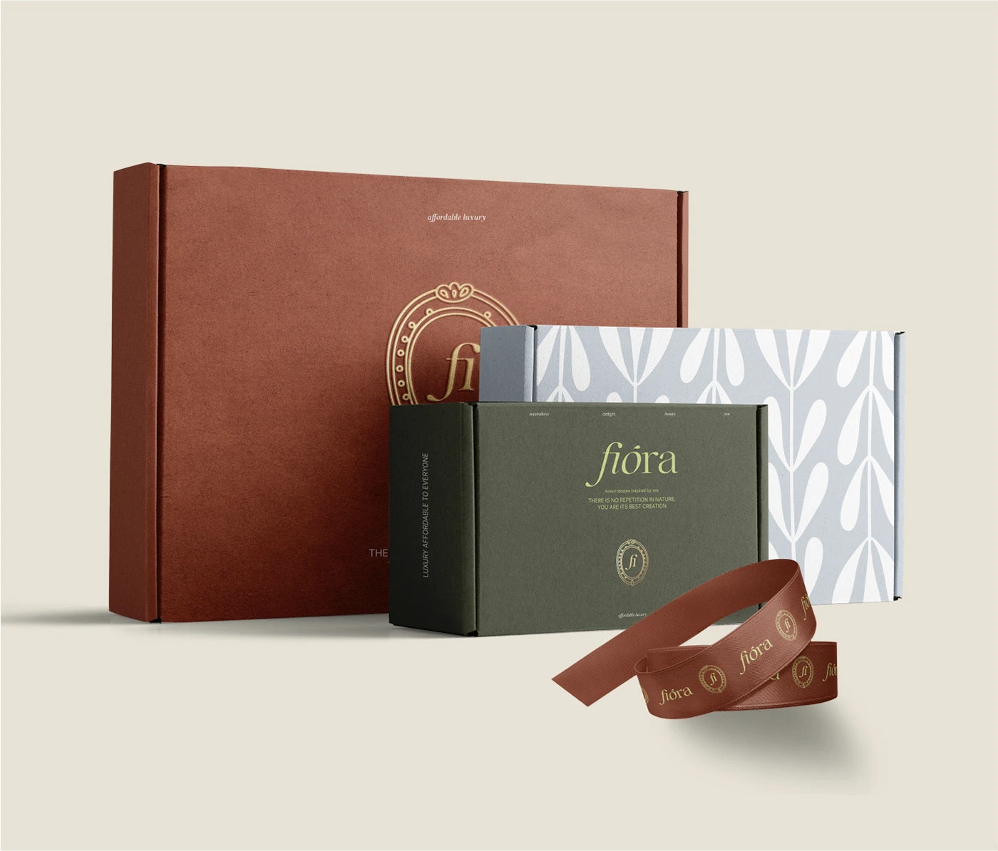
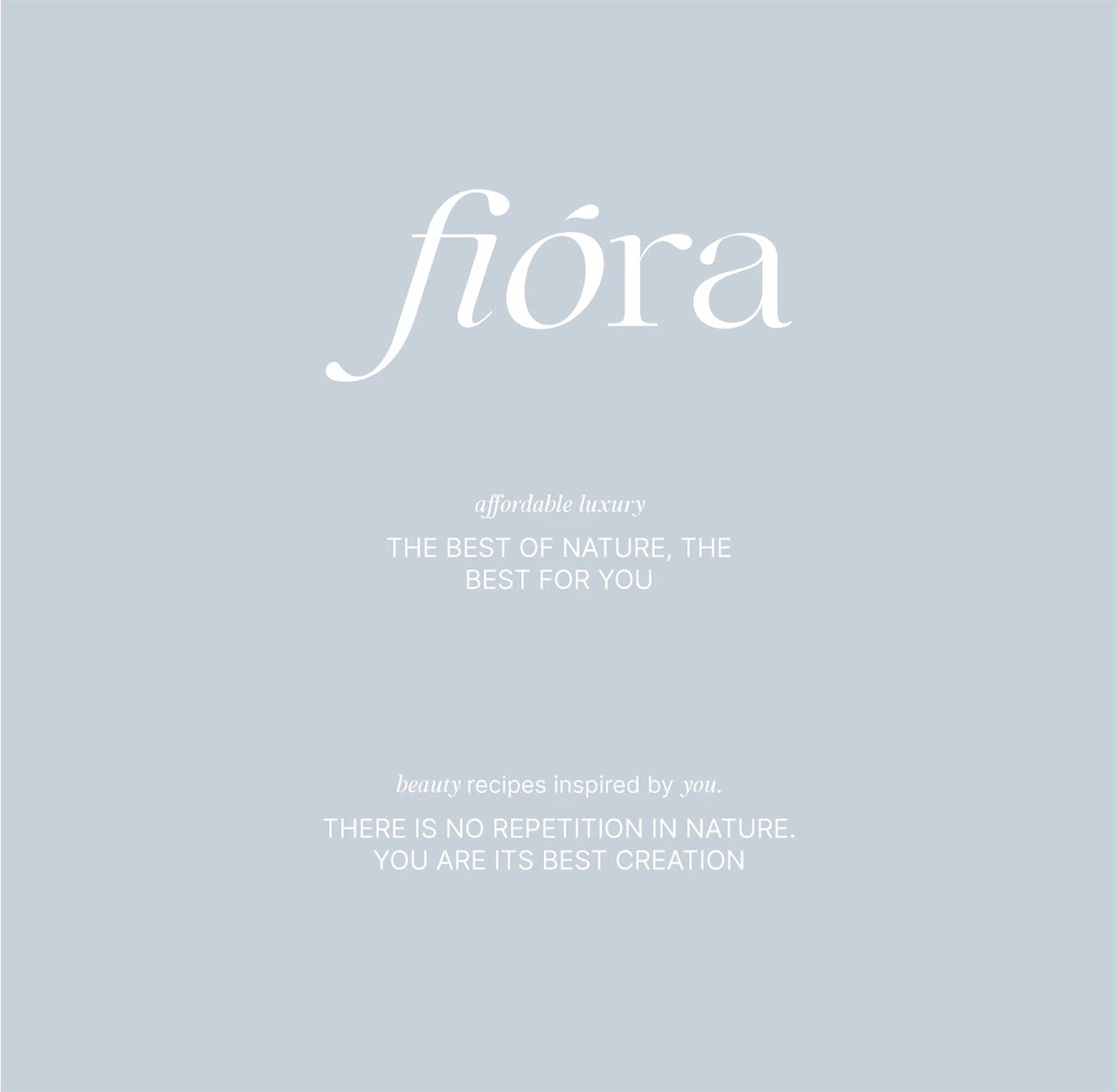
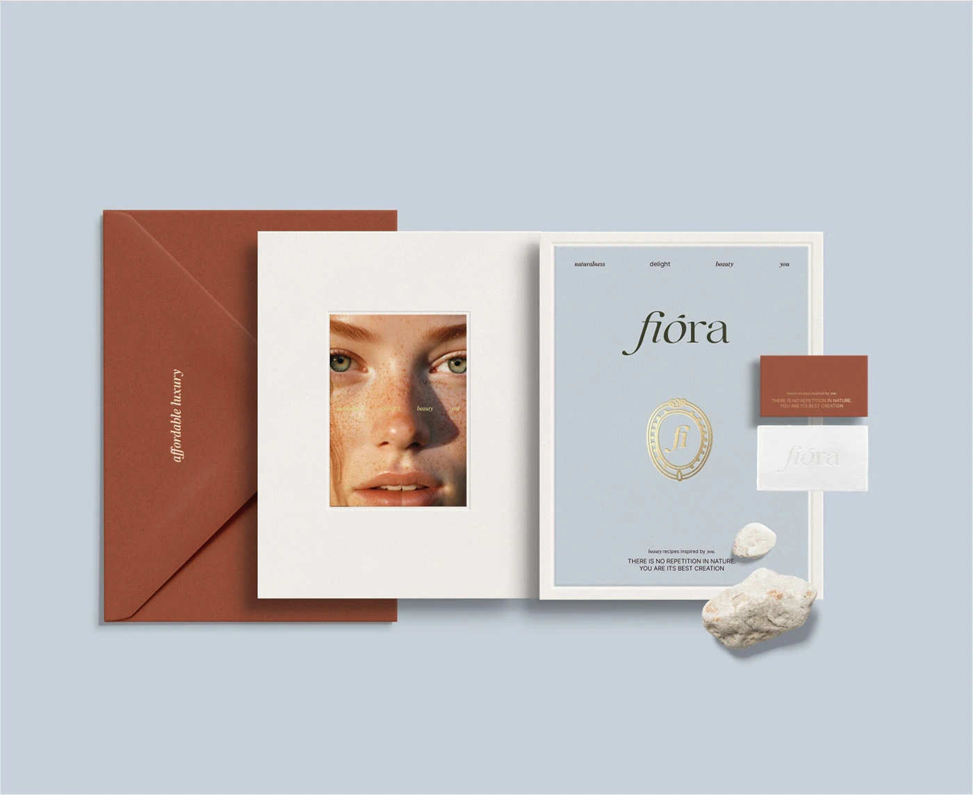
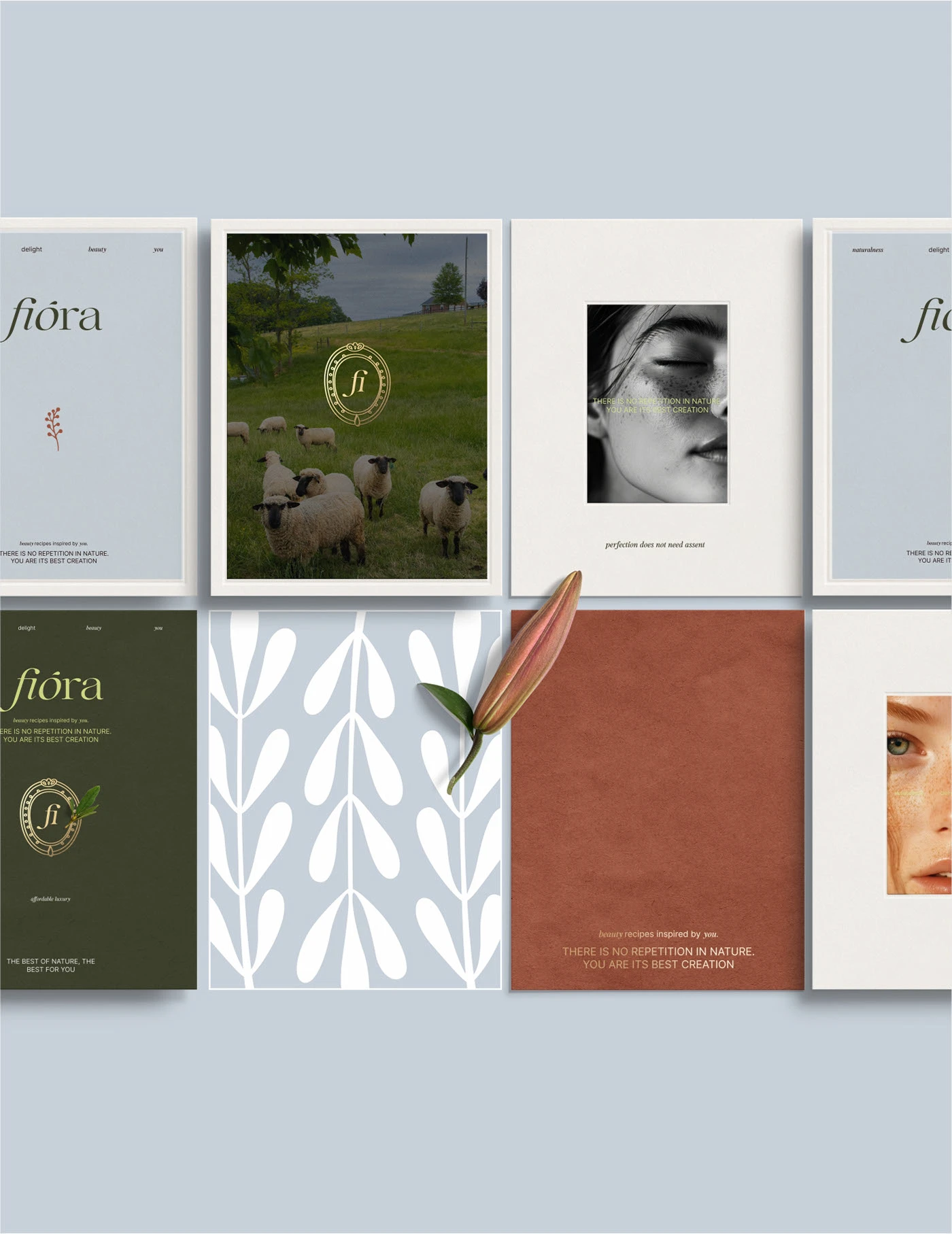
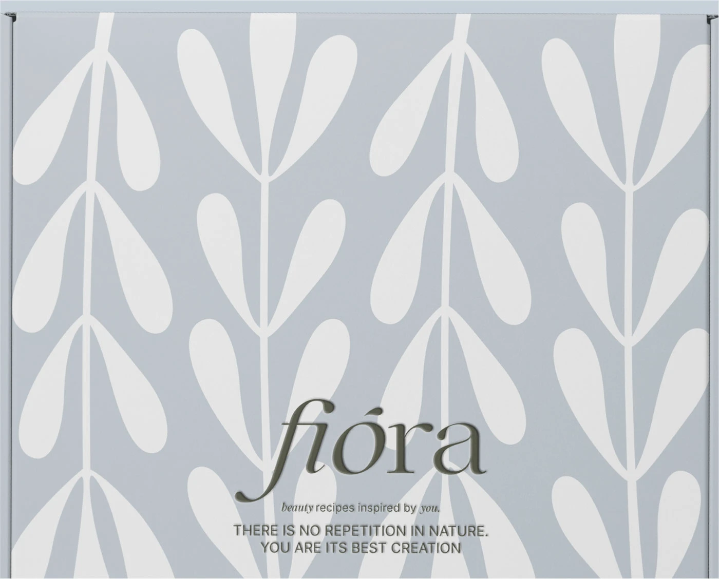
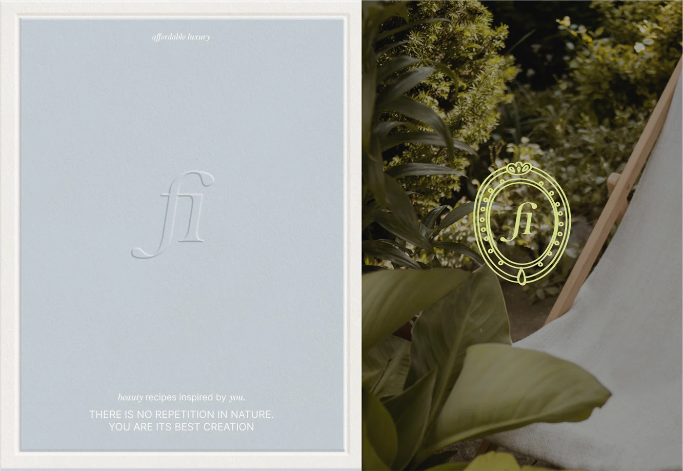
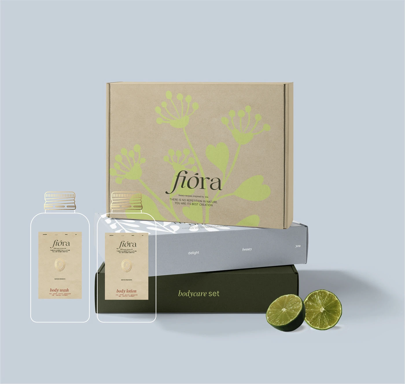
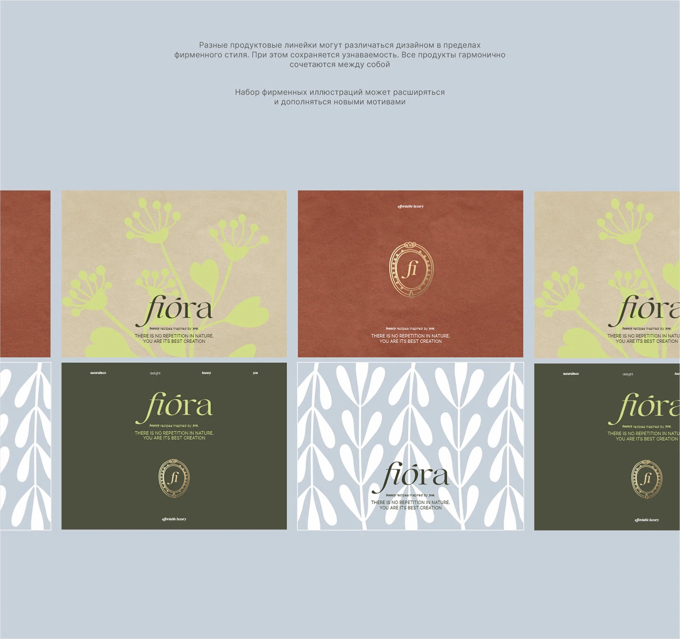
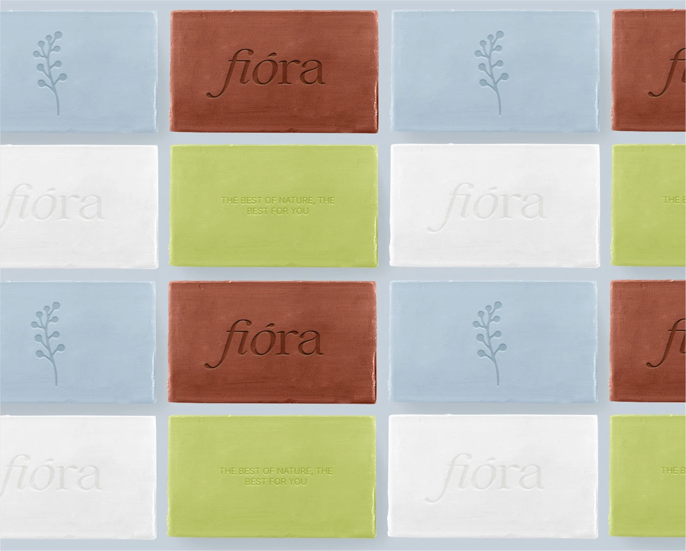
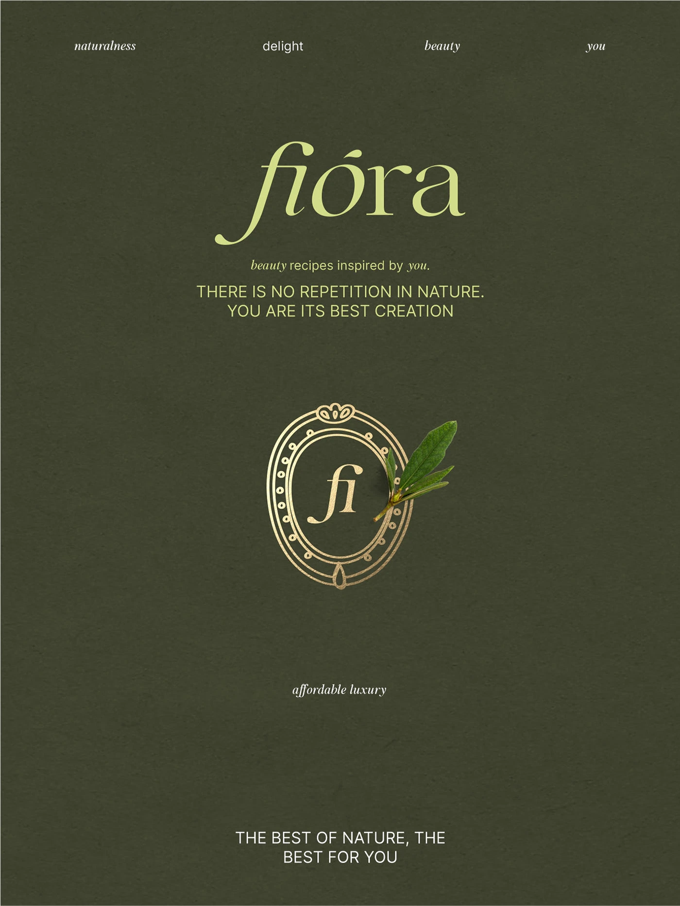
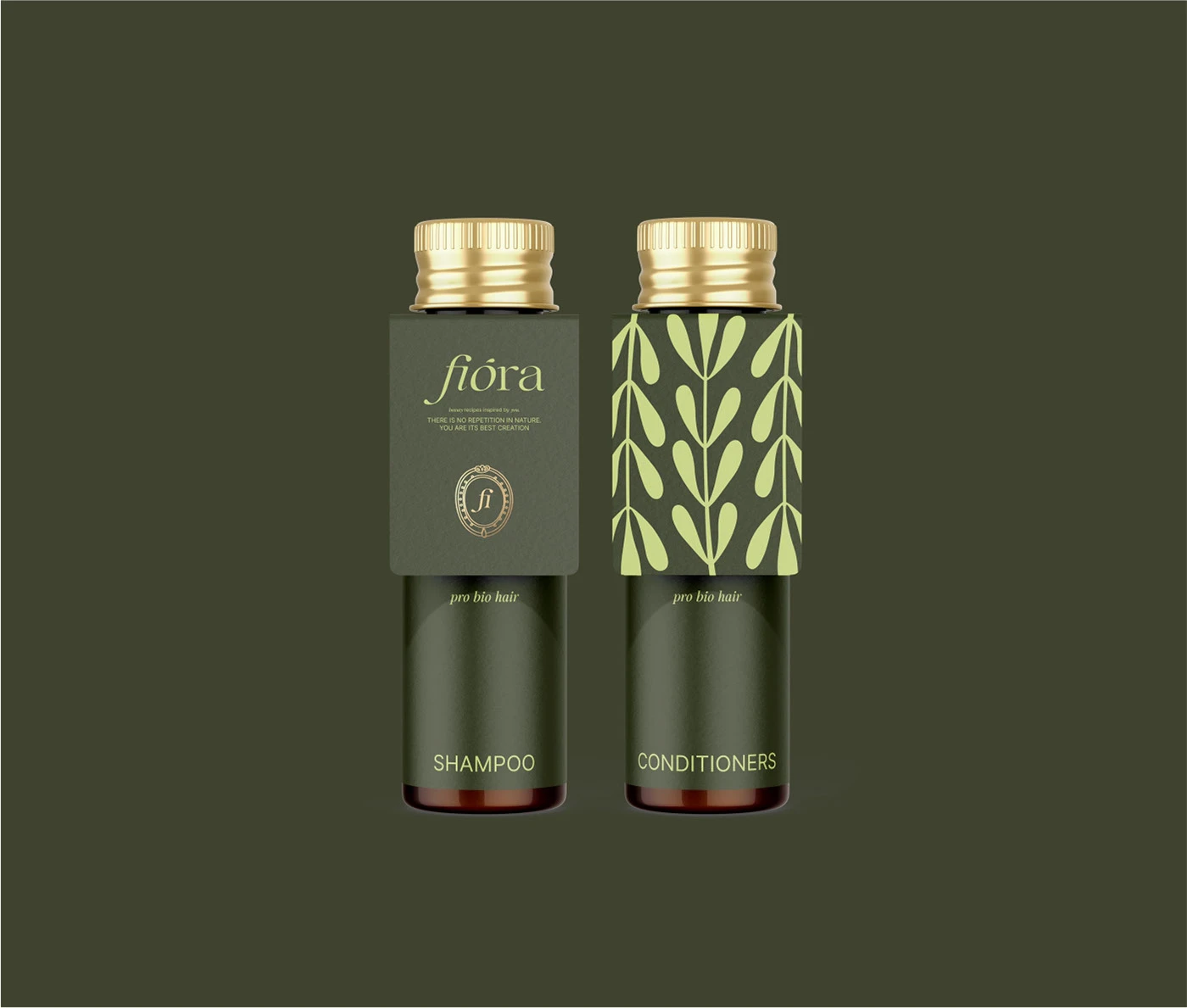
The Fiora beauty brand identity and packaging design by Anna Kiltau blends nature-inspired elegance with refined luxury. A soft yet confident color palette, botanical illustrations, and minimal typography work together to create a visual language that feels timeless and modern. Each element—from the embossed details to the thoughtful material choices—reflects a brand rooted in authenticity, quality, and a deep connection to nature.
This project is part of our curated collection of exceptional brand identity and packaging designs from around the world. At Fivestar Branding, we not only showcase inspiring creative work, but also help businesses develop their own distinctive visual identities that stand out in their industries.





Comments