
Baek
- Shane Wilson
- 36 minutes ago
- 1 min read
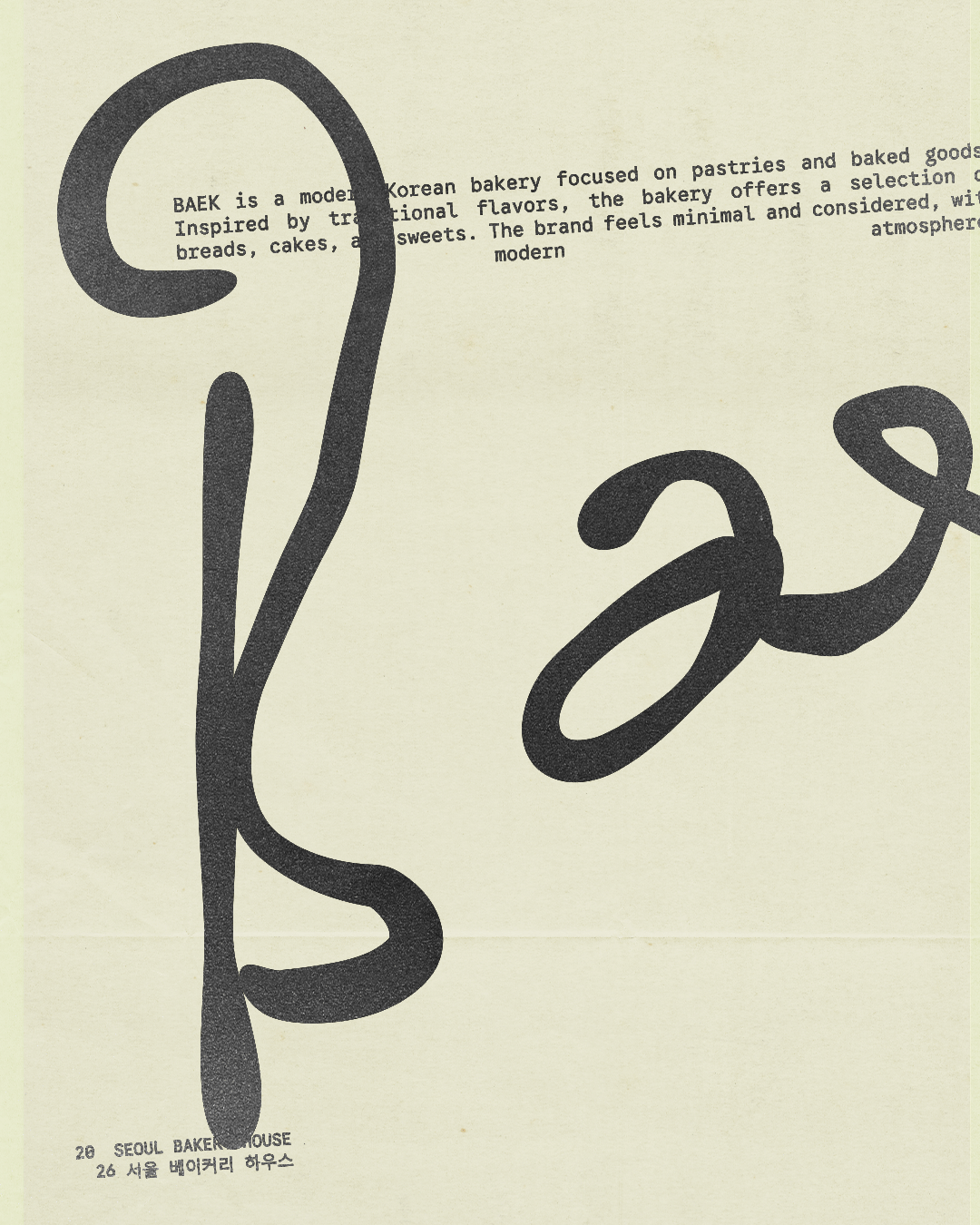
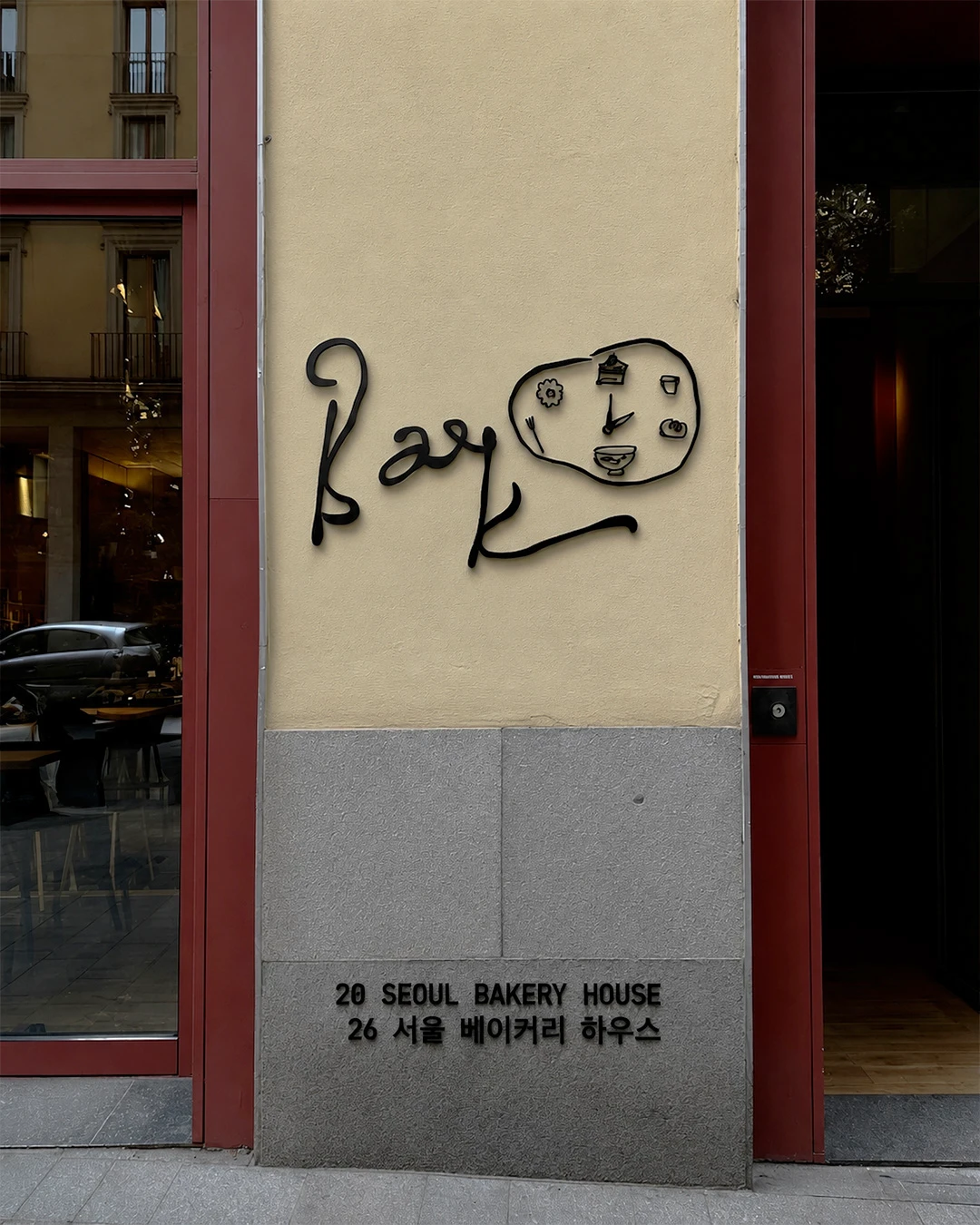
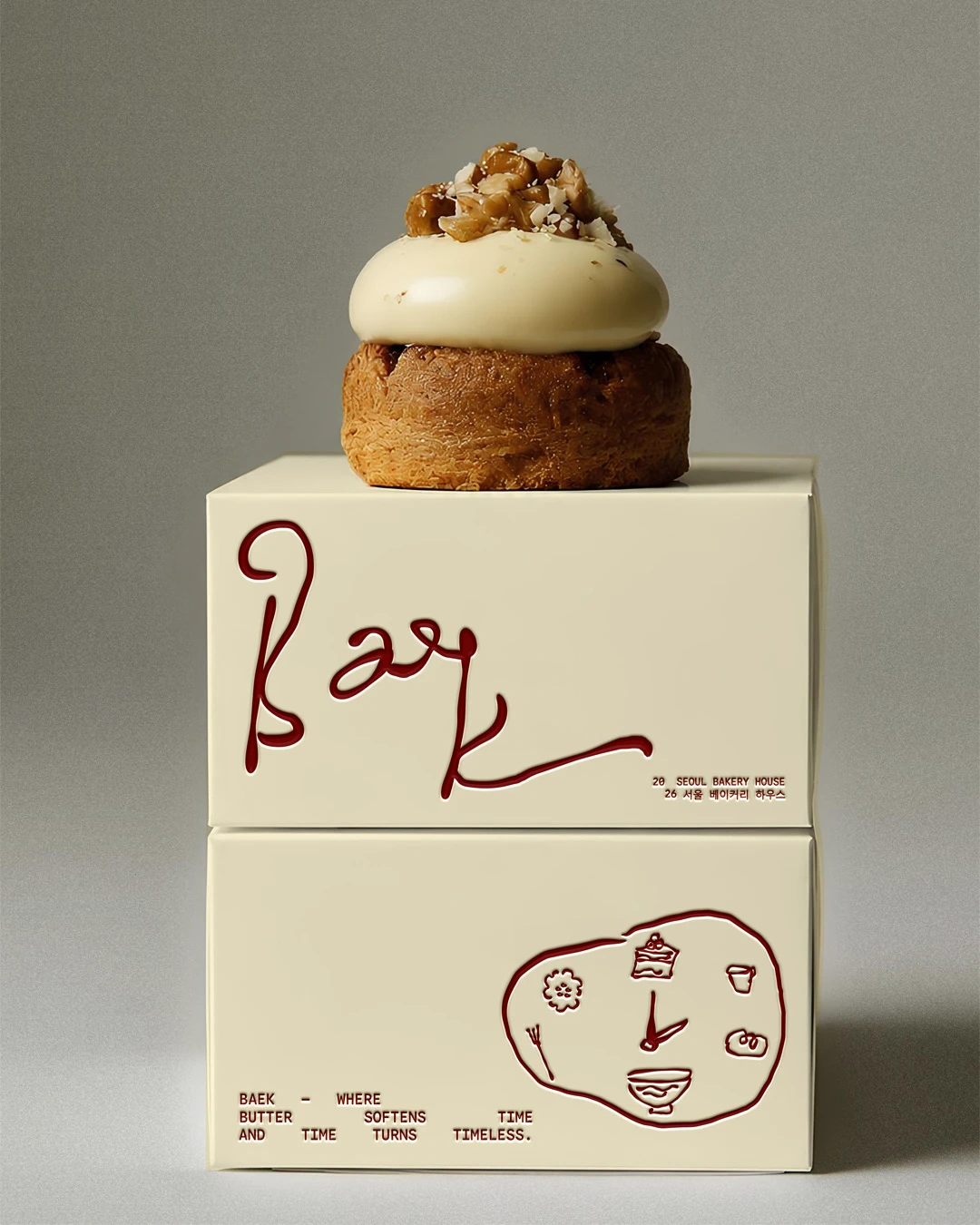
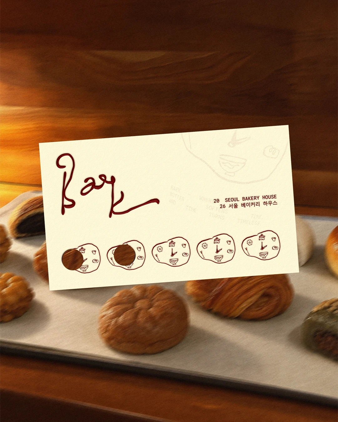
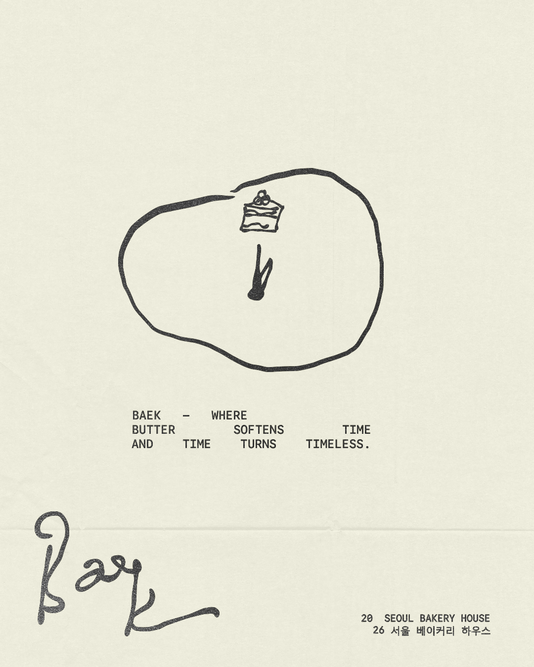
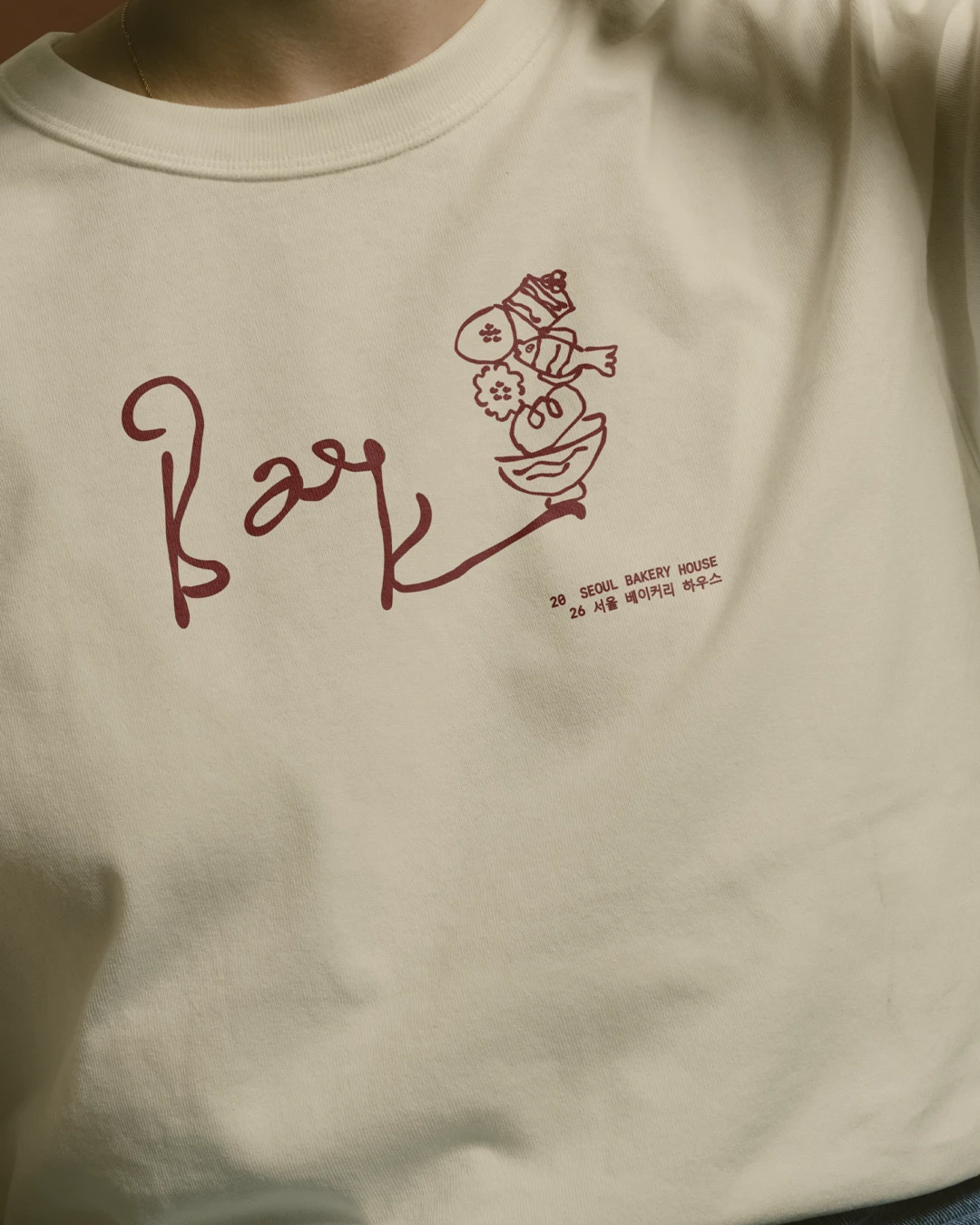
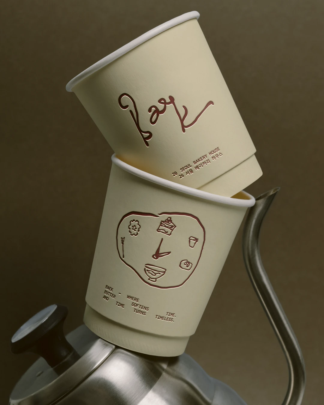
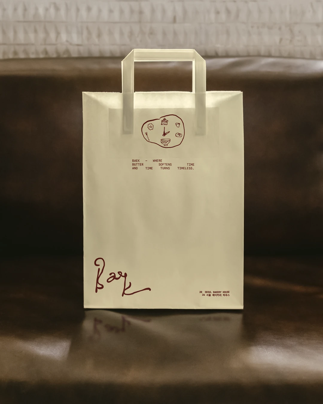
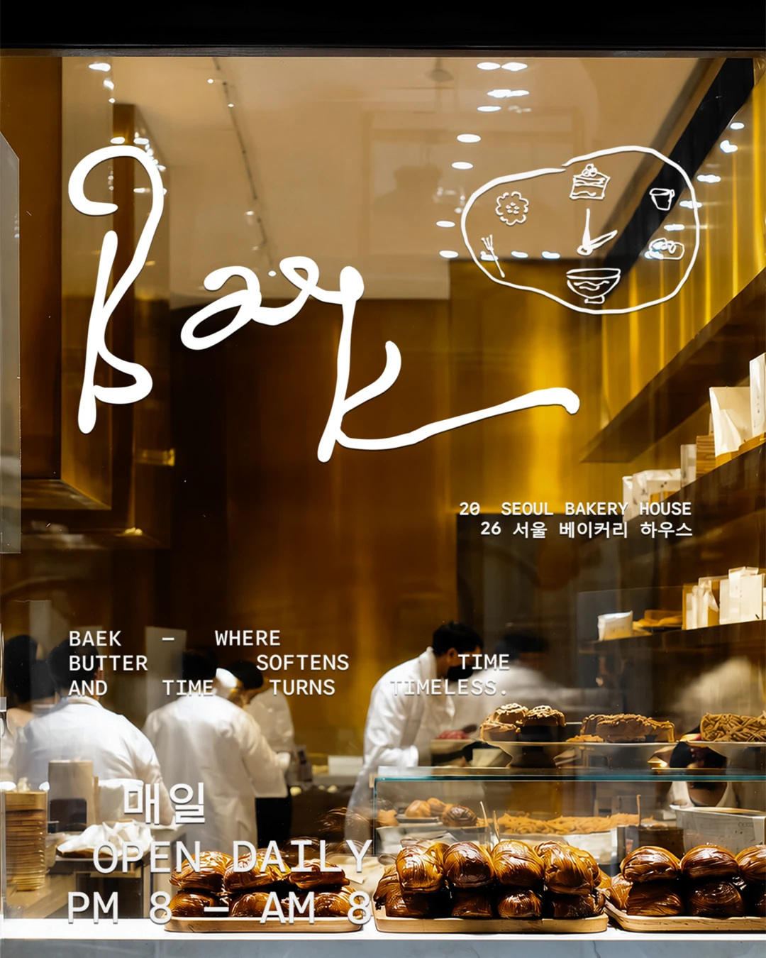
Baek Korean Bakery brings a soft, refined approach to bakery branding, pairing cultural influence with a clean modern identity system. Designed by Laura Hashem, the project feels warm, minimal, and quietly memorable — the kind of bakery brand that does not need to shout to feel distinctive.
What makes this identity work is its balance. The design feels contemporary without losing its sense of place, giving the bakery a visual language that feels approachable, thoughtful, and polished.


Fivestar Branding curates global design inspiration to showcase the best in packaging, logo design, and brand identity. Beyond curation, we are a full-service branding agency based in Ellenton, Florida and working worldwide — crafting bold, modern identities that help businesses stand out in competitive markets.