
The Doses
- Shane Wilson
- Dec 11, 2025
- 1 min read

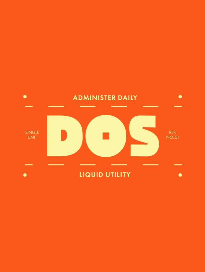
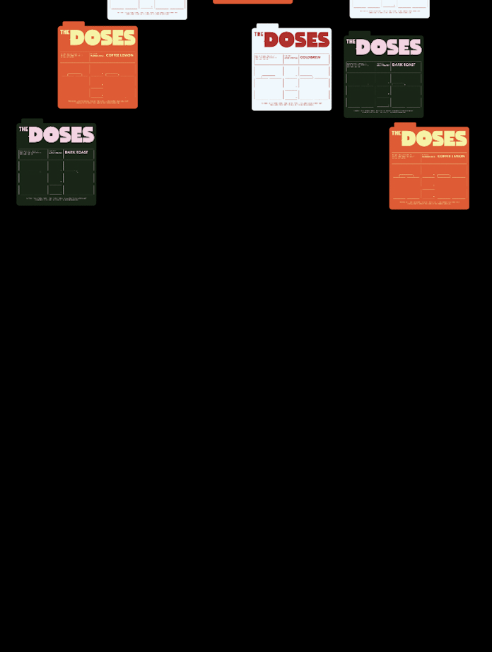
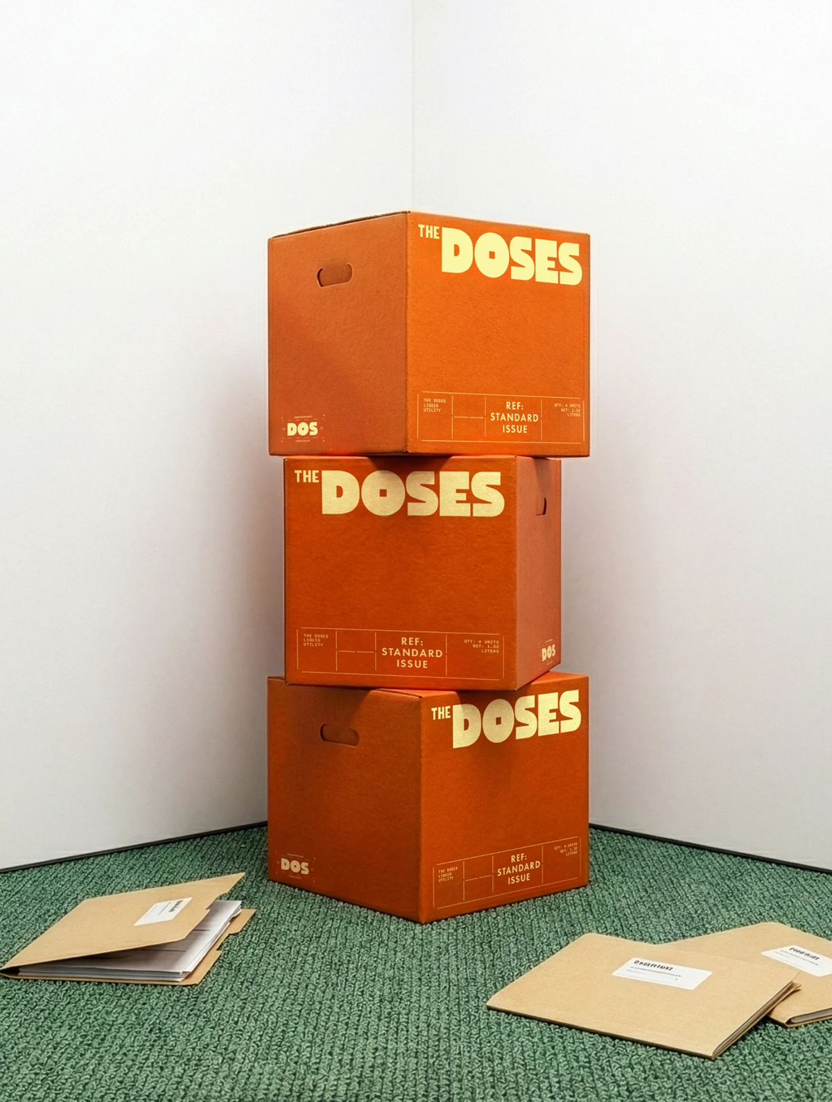
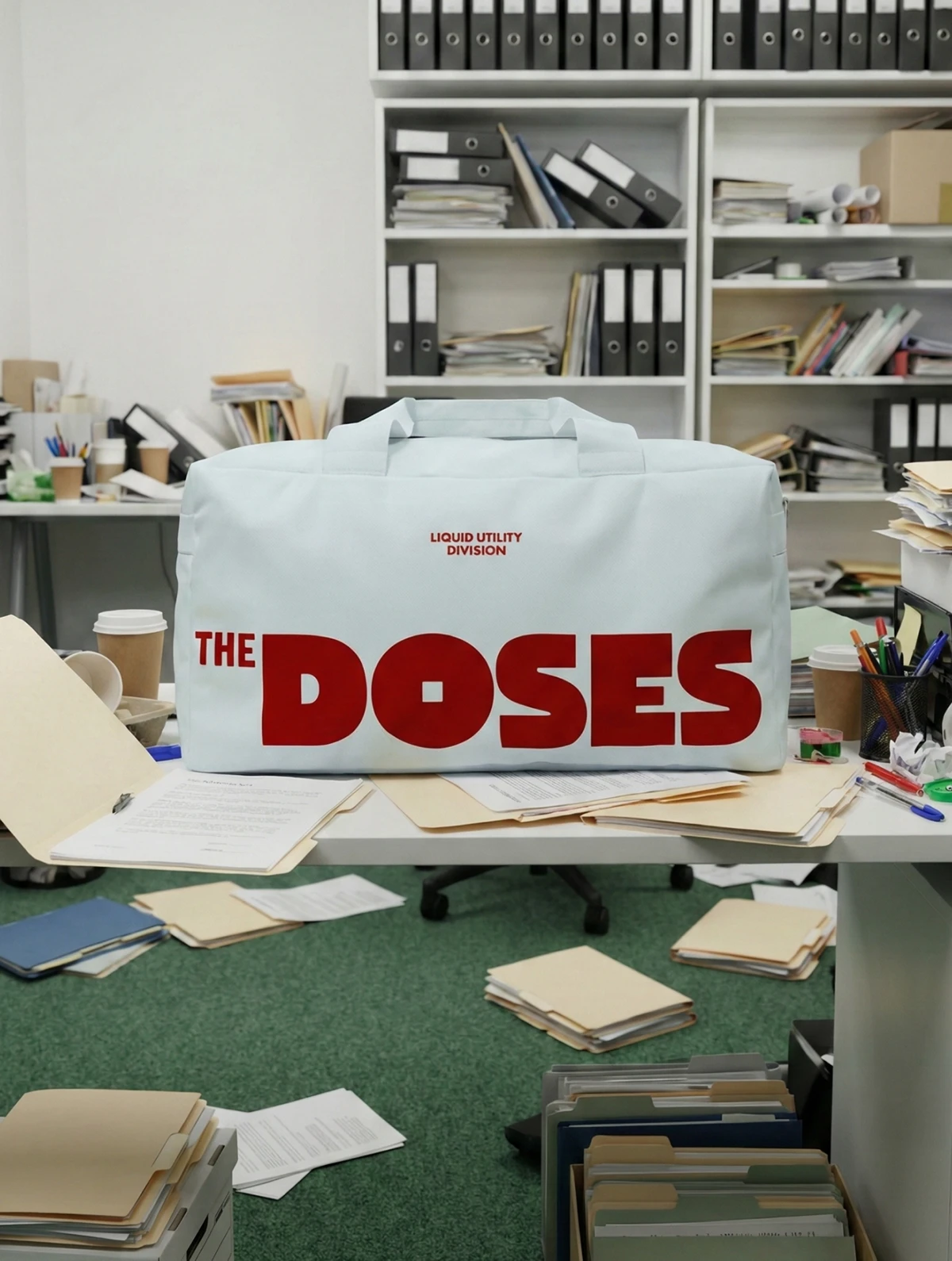
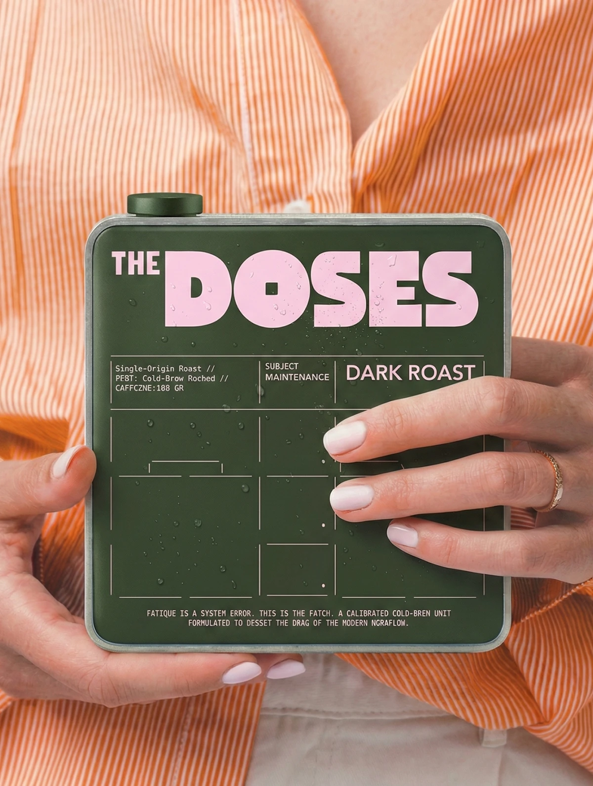
The Doses brings a sharp new voice to the emerging coffee–energy drink category, and WOBL Creative elevates it with packaging that feels equal parts functional, modern, and intentionally bold. The system leans into dose-based color architecture—each flavor defined by its own confident hue—creating instant differentiation and a visual rhythm that feels almost medicinal in its precision. Clean sans-serif typography, balanced layout spacing, and sleek can compositions give the brand a clinical-wellness edge without losing its caffeine-fueled attitude.


Fivestar Branding curates global design inspiration to showcase the best in packaging, logo design, and brand identity. Beyond curation, we are a full-service branding agency based in Ellenton, Florida and working worldwide—crafting bold, modern identities that help businesses stand out in competitive markets.


