Paloma
- Shane Wilson
- 2 days ago
- 1 min read

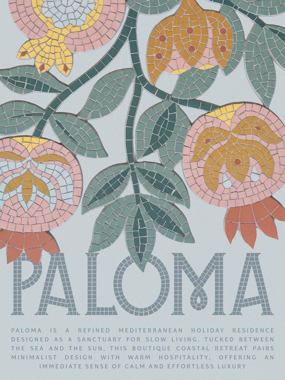
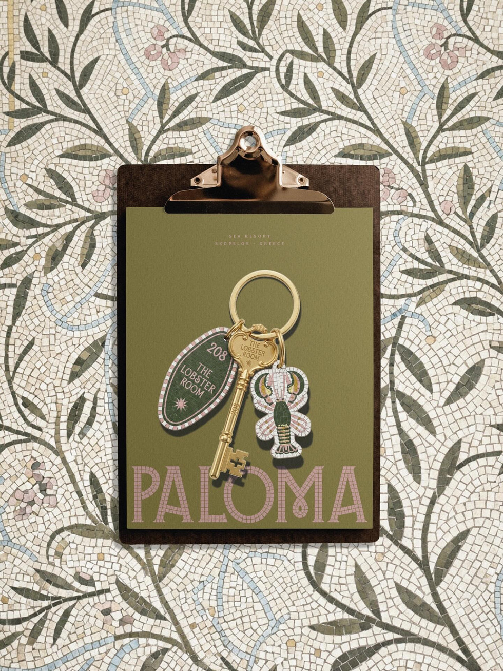
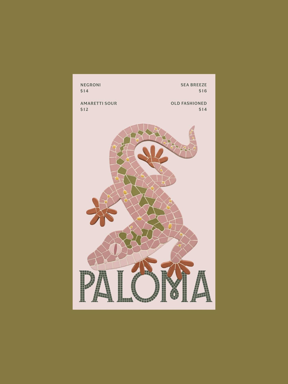
Paloma by studio.seqoya is a standout hospitality branding project for a refined Mediterranean holiday residence built around calm, texture, and a strong sense of place. What makes the identity work so well is the way the mosaic tile system becomes more than a decorative style — it becomes the visual language of the entire resort.
The Paloma wordmark feels architectural and tactile, almost as if it belongs on the walls, floors, signage, and sun-washed courtyards of the property. That same mosaic language carries into the lemon illustrations, floral details, ornamental borders, key tags, umbrellas, posters, and environmental graphics, giving the brand a world that feels cohesive without becoming repetitive.
The color palette is another major strength. Dusty pink, olive green, soft cream, muted coral, pale blue, and warm yellow create a look that feels coastal, warm, and quietly luxurious without falling into generic resort branding. It has personality, but it still feels relaxed. It has ornament, but it never feels heavy.


Fivestar Branding curates global design inspiration to showcase the best in packaging, logo design, and brand identity. Beyond curation, we are a full-service branding agency based in Ellenton, Florida and working worldwide — crafting bold, modern identities that help businesses stand out in competitive markets.