
Branding Color Palette Trends for 2026
- Shane Wilson
- Mar 11
- 1 min read

Color plays a defining role in brand identity, shaping how audiences emotionally connect with a product, service, or experience. As we move into 2026, a clear direction is emerging across branding and design—muted earth tones, grounded neutrals, and sophisticated natural palettes are taking center stage.
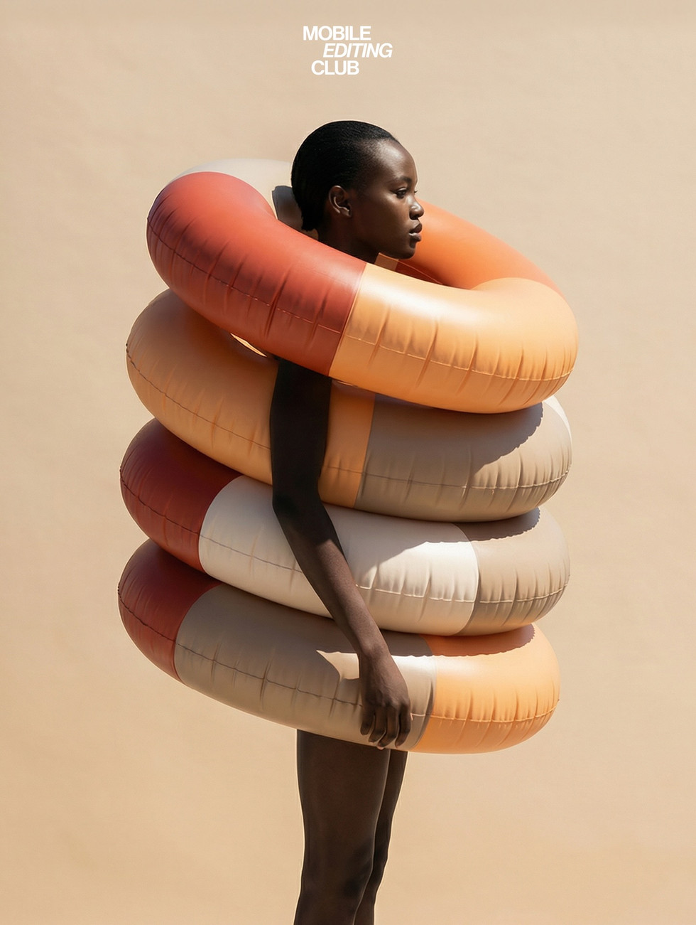
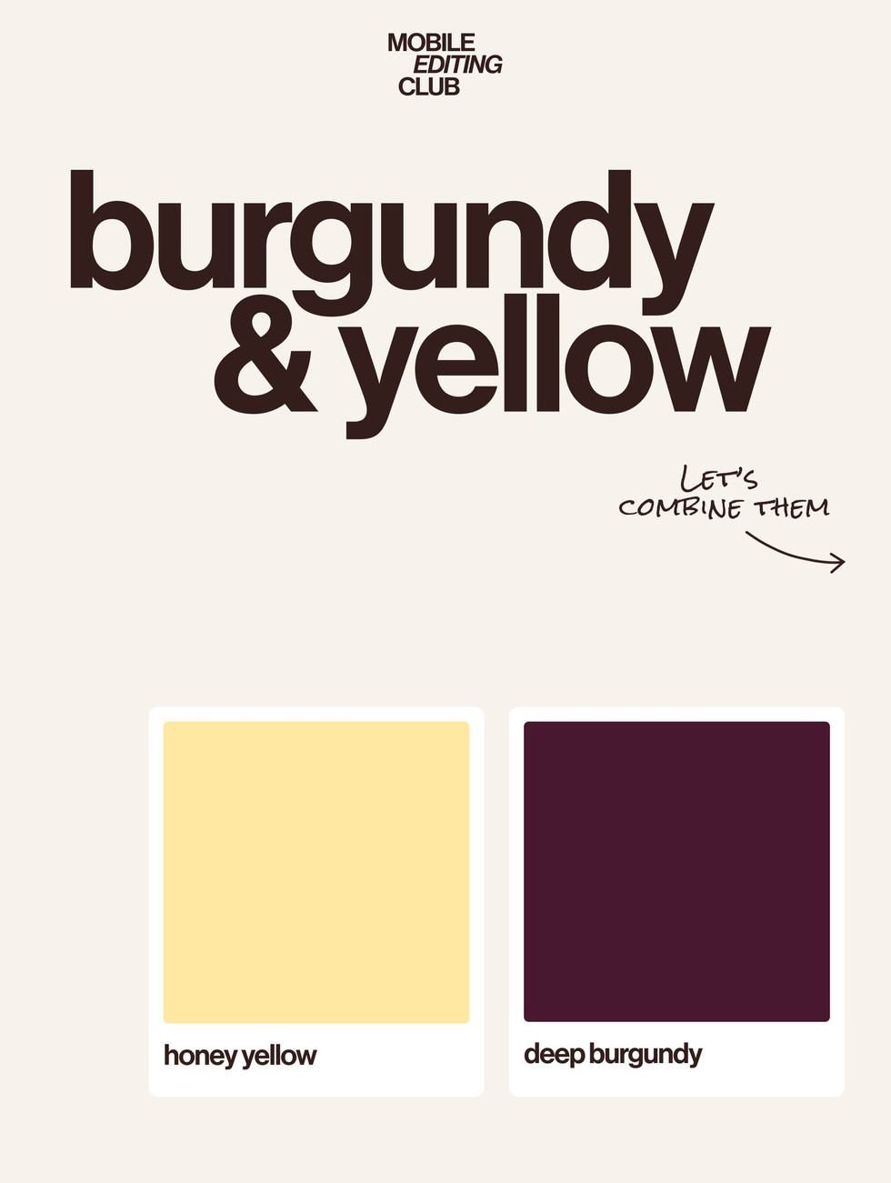
This curated color trend exploration by Adriana Bubori in collaboration with Mobile Editing Club highlights a series of palettes that reflect this shift. From terracotta and clay-inspired hues to dusty rose, misty blue, and rich burgundy, the palettes demonstrate how contemporary brands are moving toward calmer, more tactile visual identities.
Rather than relying on highly saturated colors, many modern brand systems are embracing softened pigments paired with grounding neutrals like taupe, stone, and warm gray. These combinations create color systems that feel balanced, refined, and emotionally resonant.
These palettes are increasingly visible across lifestyle brands, boutique hospitality concepts, skincare and wellness packaging, café identities, and modern product branding—where thoughtful color relationships help define the overall tone of a brand.


Fivestar Branding curates global design inspiration to showcase the best in packaging, logo design, and brand identity. Beyond curation, we are a full-service branding agency based in Ellenton, Florida and working worldwide—crafting bold, modern identities that help businesses stand out in competitive markets.


