
iTO
- Shane Wilson
- May 1, 2025
- 1 min read

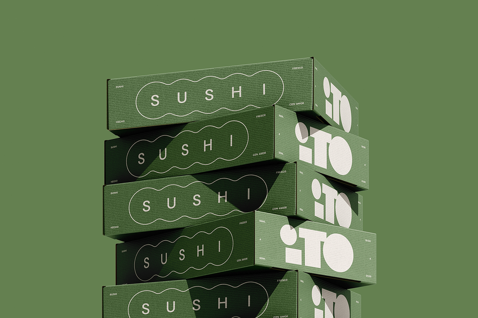
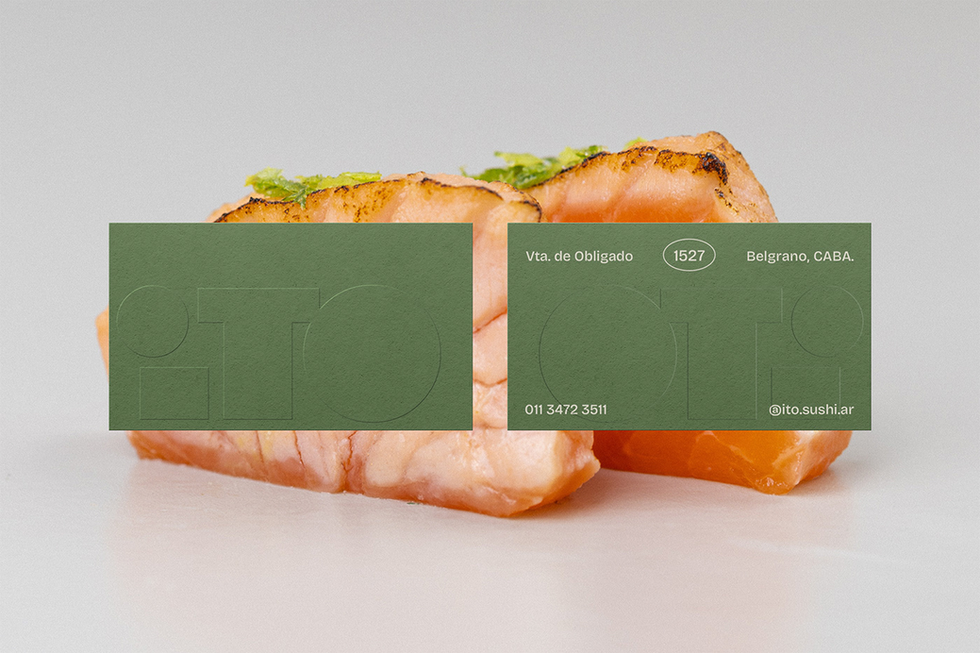
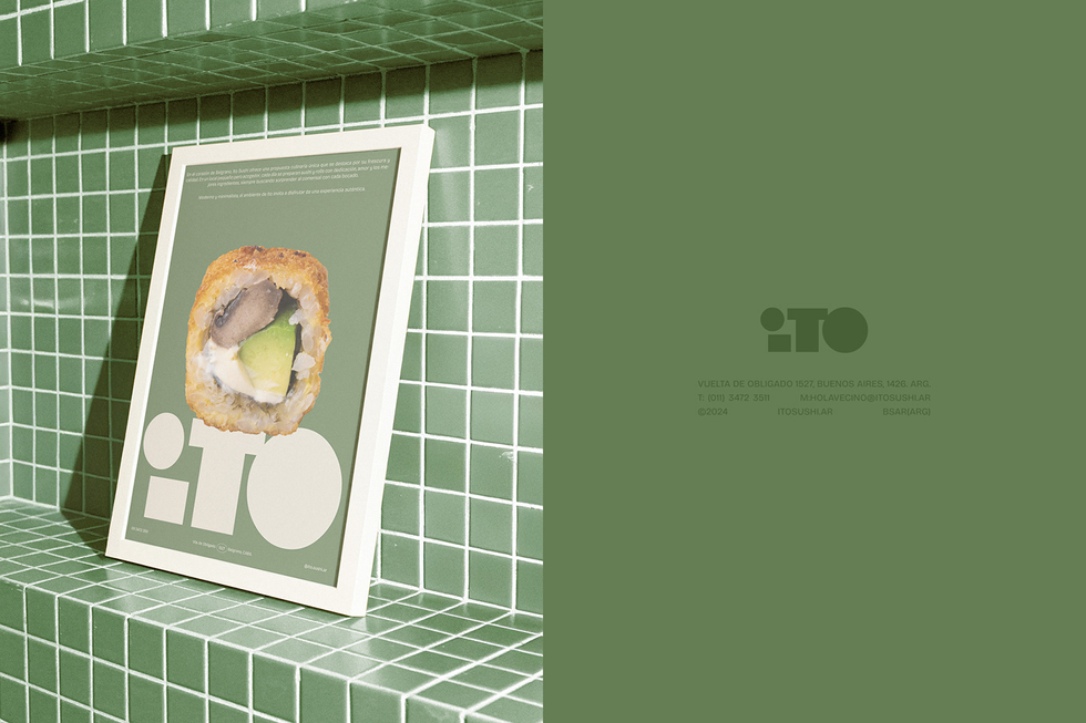
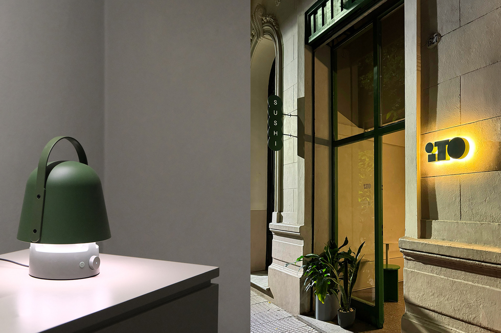
Fresh, modern, and ultra-minimal—this sushi brand identity for iTO Sushi by Tricota Design showcases a striking use of geometric typography, earthy greens, and clean packaging layouts. From bold logo treatments to cohesive takeout boxes, signage, and print collateral, this branding work is a masterclass in food identity design.


At Fivestar Branding, we regularly spotlight exceptional design from around the world to inspire our own creative process and our clients' visions. This project is one such example—curated not just for its beauty, but because it reflects the kind of thoughtful, strategic identity work we champion in our own branding, packaging, and website design services.


