
North Country Outdoors
- Shane Wilson
- Apr 29
- 2 min read

Updated: Apr 30
North Country Outdoors is a rugged recreational brand built around ice houses, outdoor equipment, and cold-weather utility. Created in-house by Fivestar Branding, this concept exploration presents four distinct visual identity directions for the brand, each designed to capture a different side of northern outdoor culture.
From heritage-inspired outfitter aesthetics to bold service-driven marks and retro recreational styling, the goal was to explore how the brand could feel dependable, memorable, and deeply rooted in the outdoors while still working across real-world applications like trailers, apparel, gear, signage, and branded merchandise.
Heritage Outdoor Identity
Option 1 takes North Country Outdoors in a more elevated heritage direction, using a refined mountain illustration, expressive typography, and a deep green and bronze color palette. This concept feels established, premium, and outdoorsy without becoming overly rugged or aggressive.
The visual language works especially well across lifestyle-driven applications like canvas bags, metal details, editorial spreads, and outdoor gear. It gives the brand a sense of history and craftsmanship, almost like a trusted outfitter brand built for cabin weekends, frozen lakes, and long winters.


Rugged Utility Identity
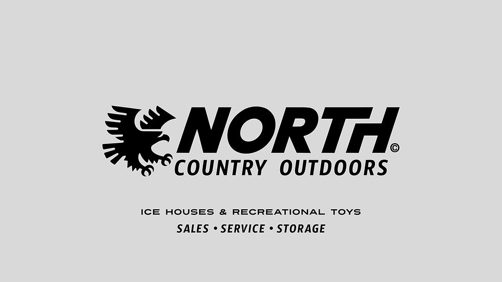
Option 2 focuses on strength, clarity, and performance. The bold italic wordmark and eagle icon create a more aggressive, service-ready identity that feels built for trailers, signage, equipment, decals, and workwear.
This direction is the most direct and practical of the four concepts. It trades some of the warmth and nostalgia of the other options for immediate readability and toughness, making it a strong fit for a business rooted in sales, service, storage, and outdoor utility.


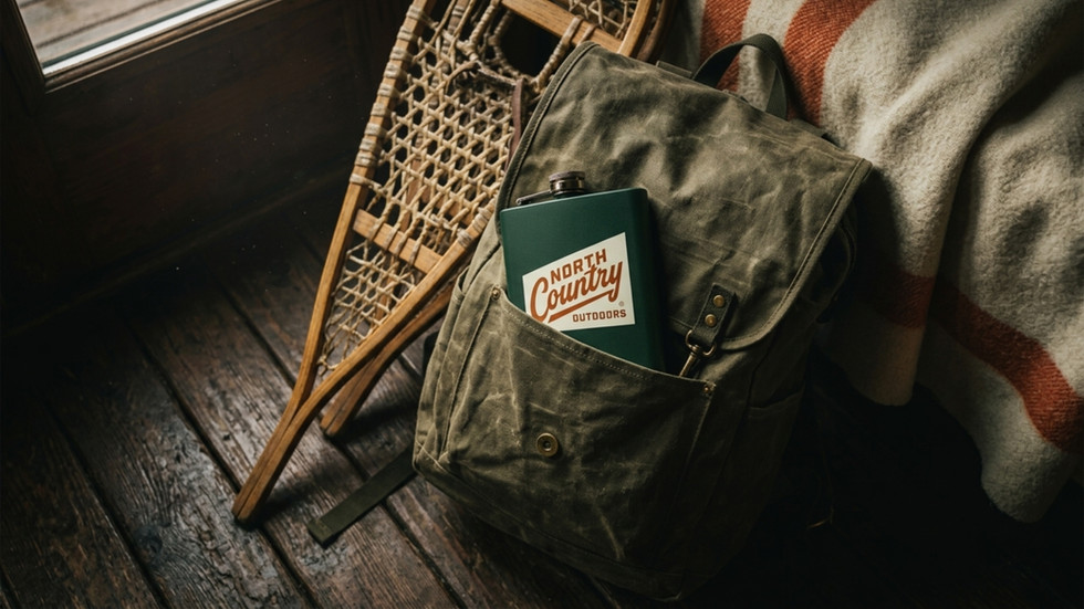
Retro Recreational Identity
Option 3 brings a warmer, more nostalgic personality to North Country Outdoors. The rounded typography, layered color mark, and teal, orange, mustard, and cream palette give this direction a vintage recreational feel with strong merchandise potential.
This concept leans into the lifestyle side of the brand, feeling approachable, fun, and memorable across mugs, patches, beanies, decals, and casual outdoor gear. It has the energy of winter weekends, old trucks, hot coffee, and well-worn outdoor essentials.


Cabin-Inspired Lifestyle Identity
Option 4 explores a more nostalgic cabin and outfitter-inspired direction, pairing bold block lettering with a sweeping script-style “Country” wordmark. The green and burnt orange palette gives the identity a warm, classic outdoor feel with strong ties to fishing, camping, ice house culture, and northern recreation.
This concept has a strong lifestyle and merchandise appeal, especially across patches, tins, bags, apparel, and cabin-inspired brand applications. It feels less like a modern service company and more like a beloved regional outdoor brand with personality, charm, and a little old-school grit.


These four directions reveal how much a brand can change through typography, color, iconography, and application style. For North Country Outdoors, the goal was not just to design a logo, but to imagine how the identity could work in the real world, on trailers, gear, apparel, signage, merchandise, and in the cold-weather environments where the brand belongs. Each concept brings out a different side of the business, giving the client a clear view of how the brand could look, feel, and function before choosing a final direction.


