Verano
- Shane Wilson
- Jan 30
- 1 min read

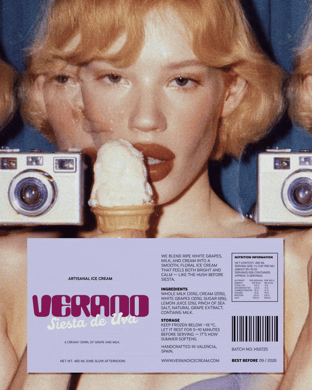
Verano Ice Cream is a vibrant brand identity inspired by slow summers, sun-drenched afternoons, and the fleeting moments that linger like memory. Designed by Blanca Doba, the project embraces warmth, nostalgia, and a lifestyle-first visual language rooted in emotion rather than perfection.
Expressive typography, confident color blocking, and playful label design work together to create a brand that feels bold yet human. Instead of leaning into hyper-premium cues or rigid minimalism, Verano positions itself as artisanal but unbothered—relaxed, familiar, and quietly joyful.
Photography and visual rhythm reinforce this feeling, capturing candid moments and everyday summer scenes that place the brand within real life rather than above it. The result is a cohesive identity that feels lived-in, approachable, and effortlessly memorable.


Fivestar Branding curates global design inspiration to showcase the best in packaging, logo design, and brand identity. Beyond curation, we are a full-service branding agency based in Ellenton, Florida and working worldwide—crafting bold, modern identities that help businesses stand out in competitive markets.