
Solace Studio
- Shane Wilson
- 1 day ago
- 1 min read

Updated: 5 hours ago
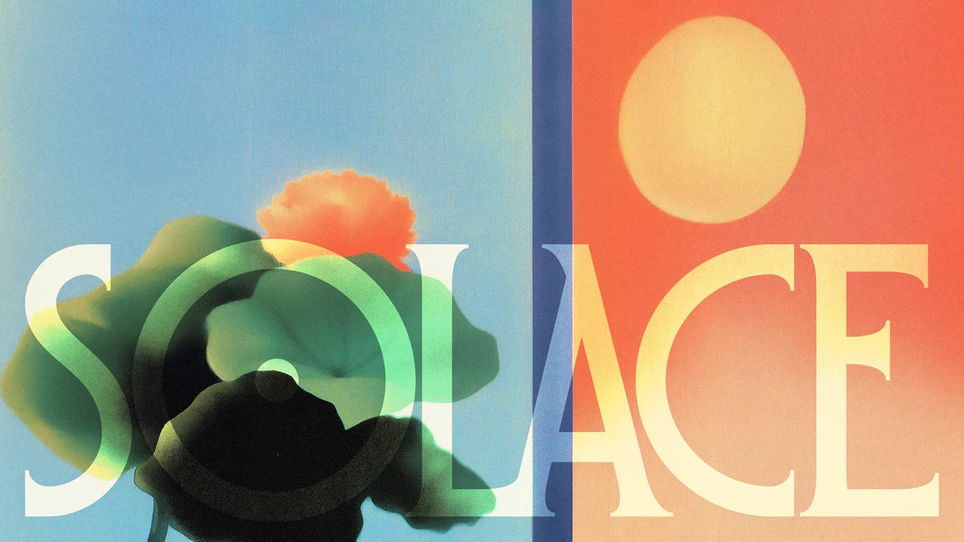
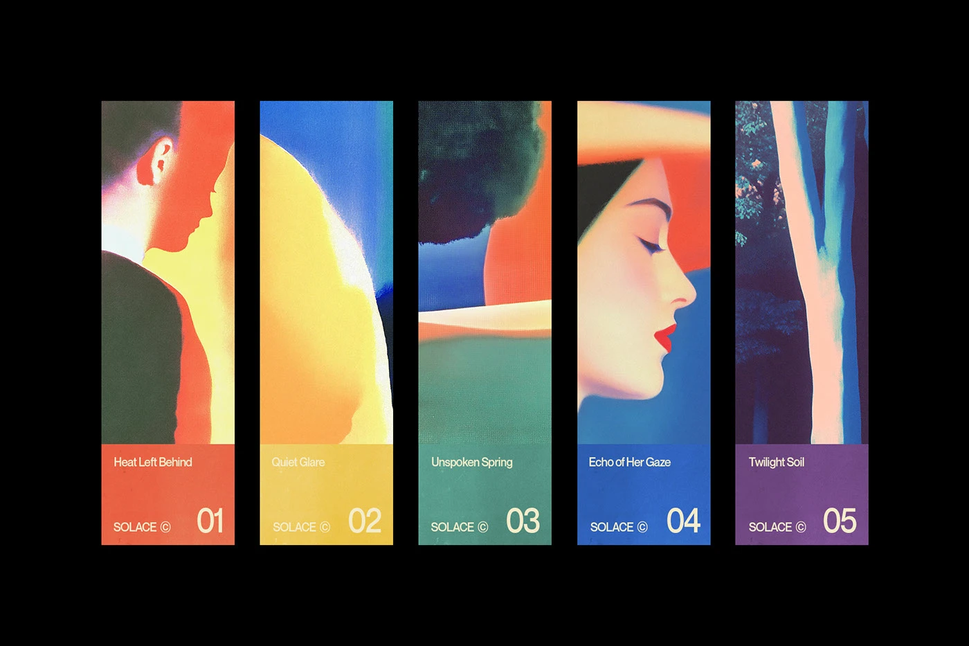
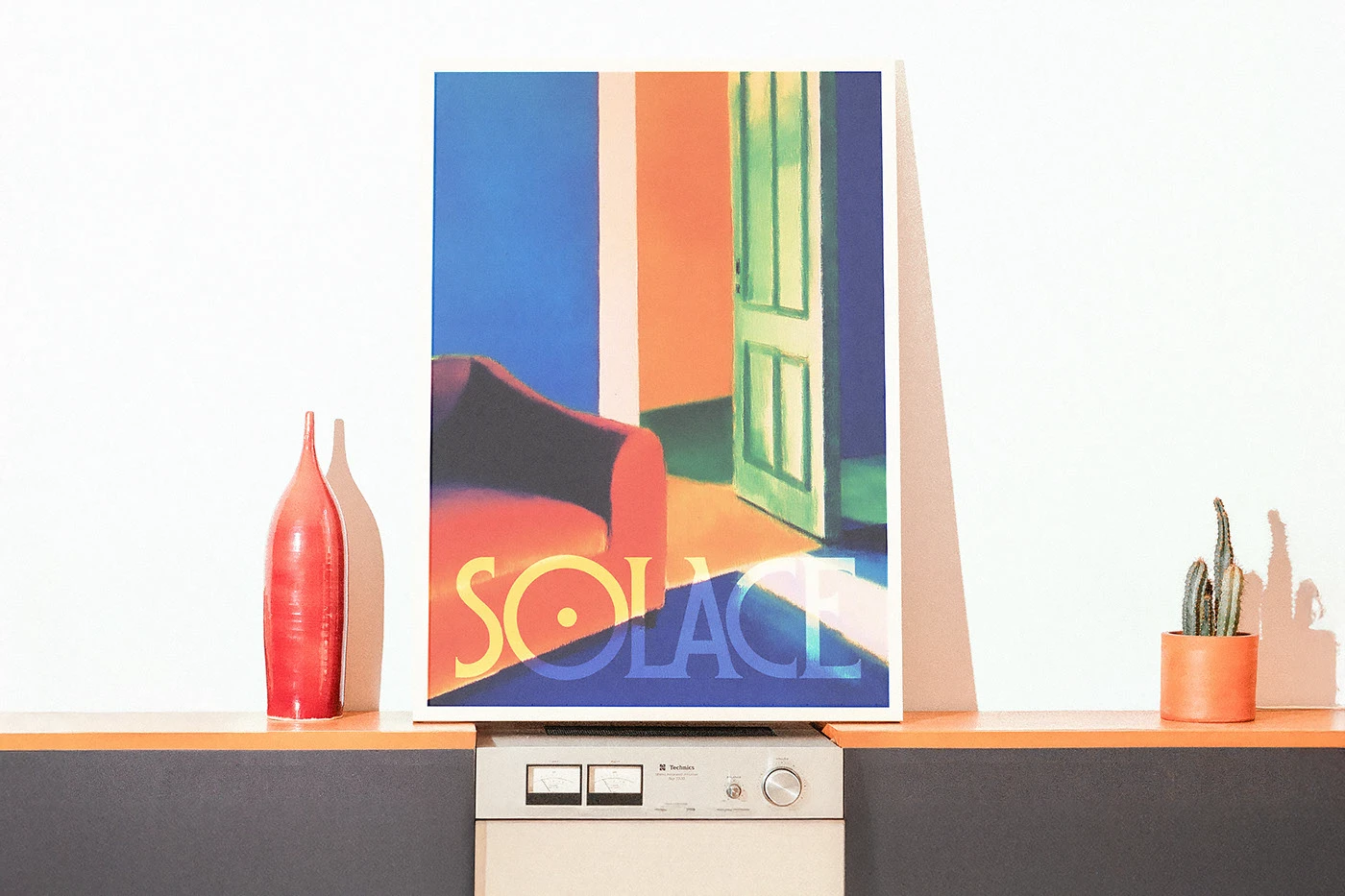
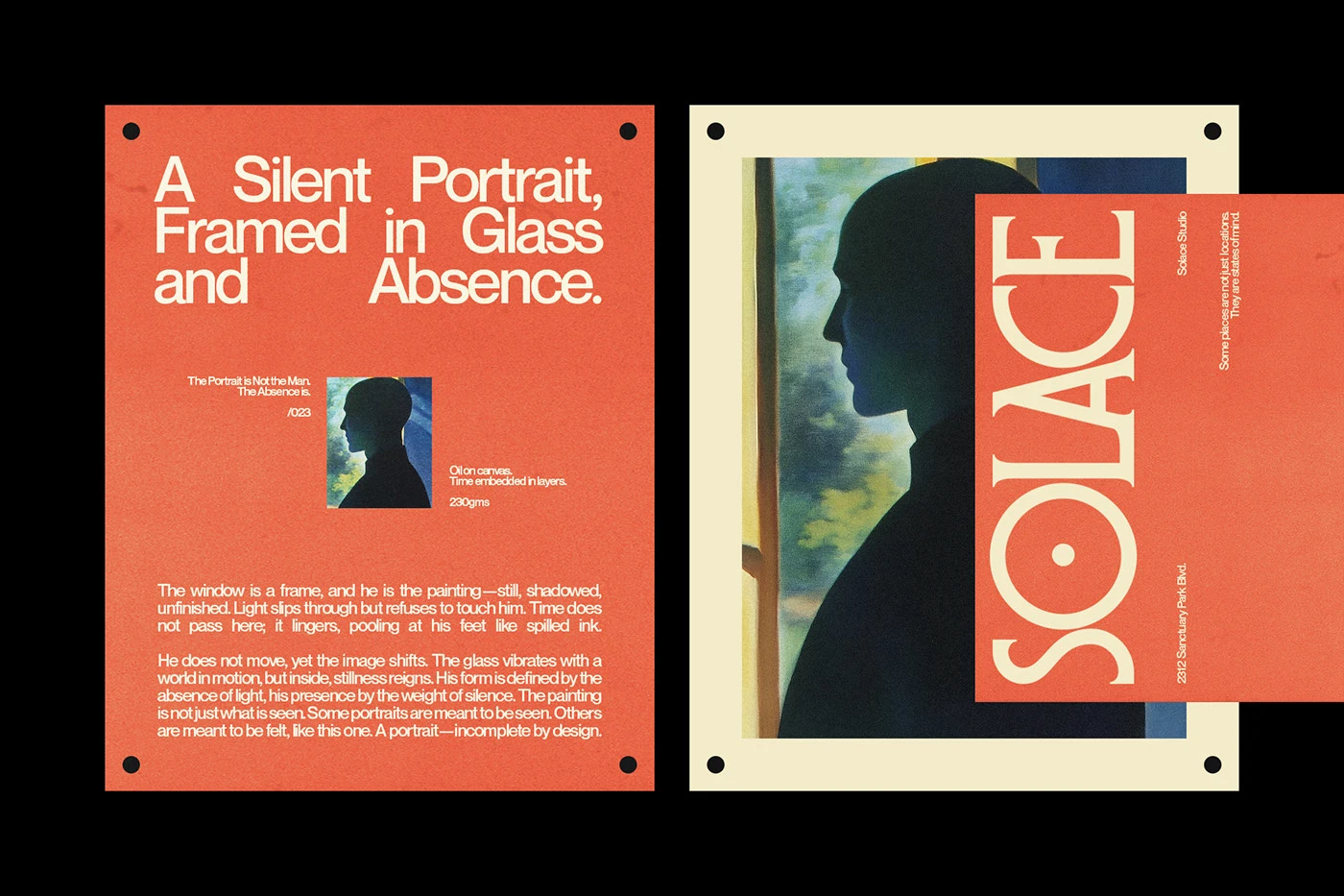
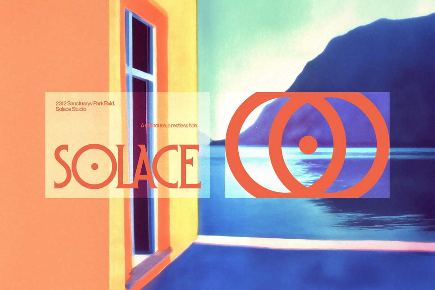
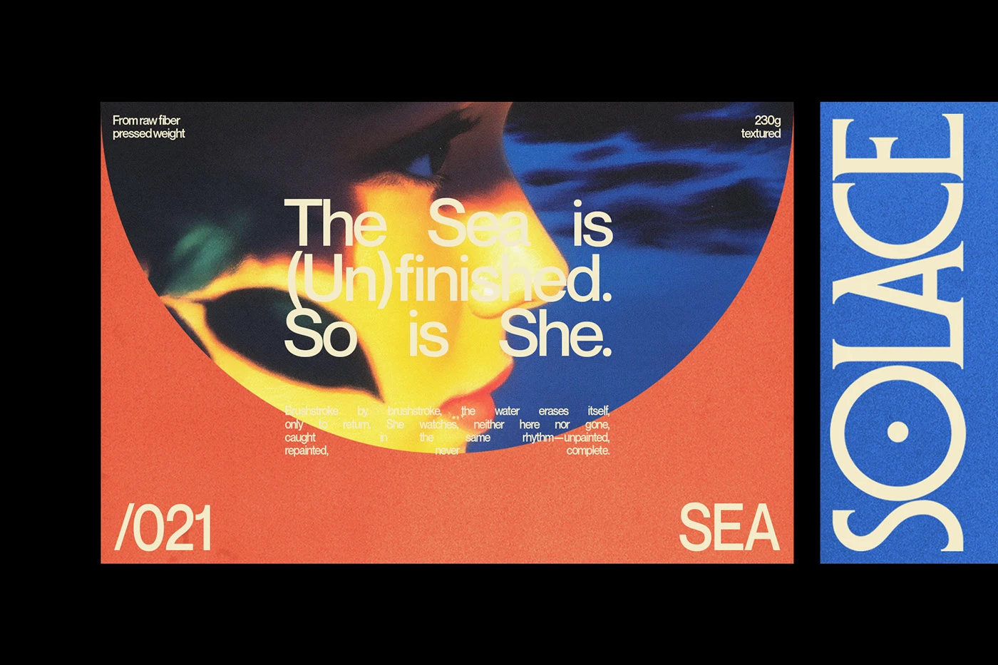
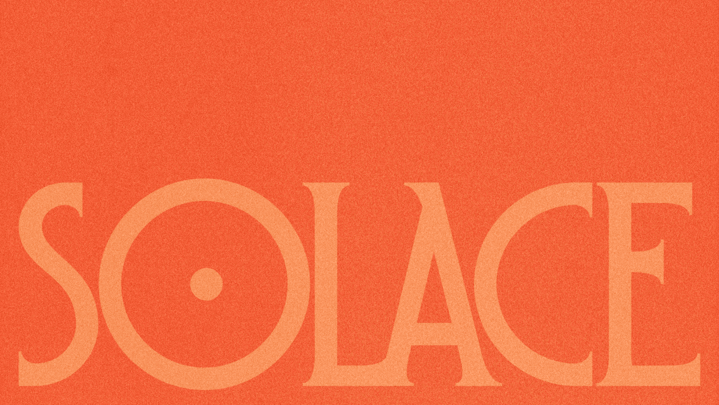
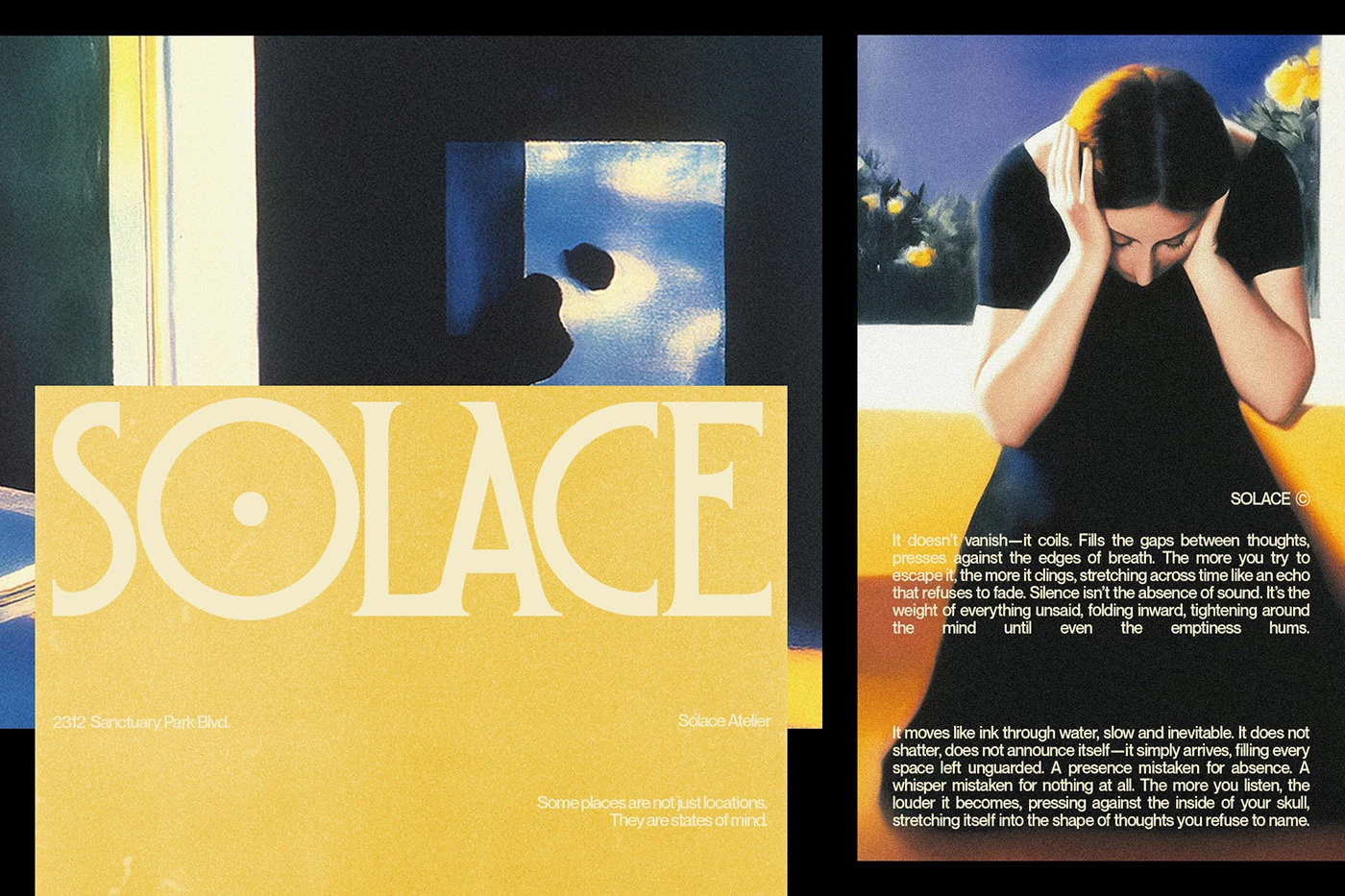
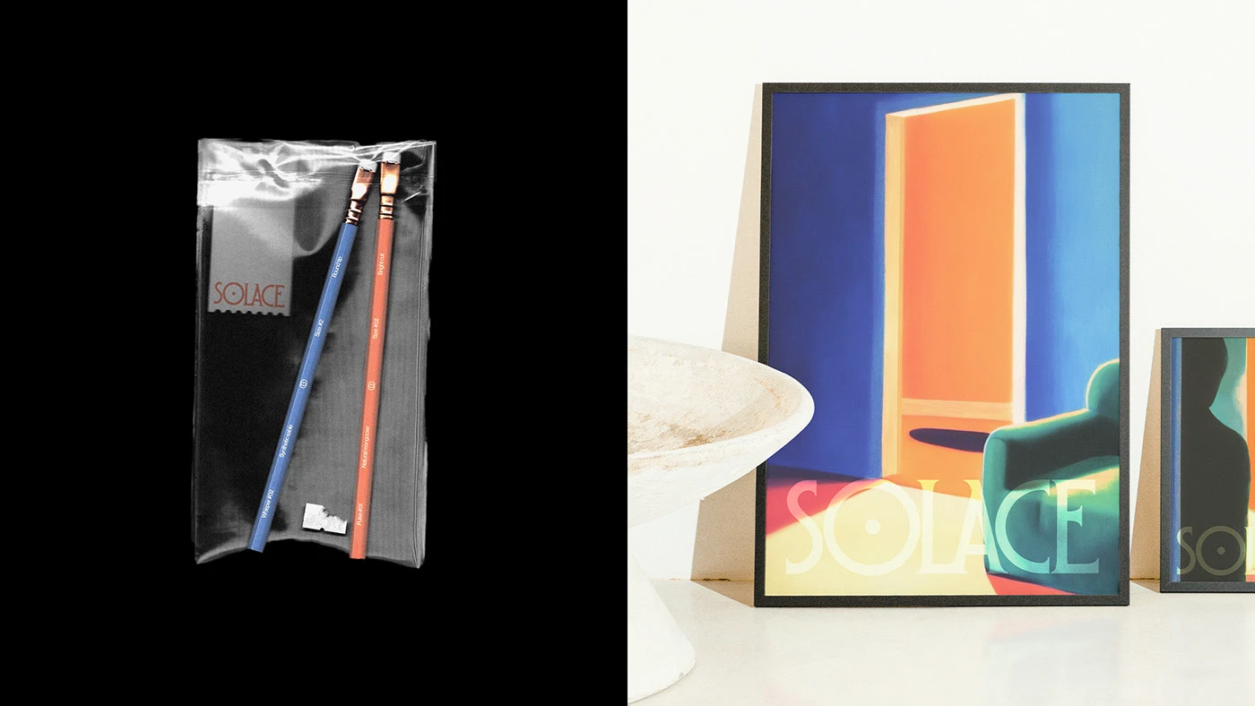
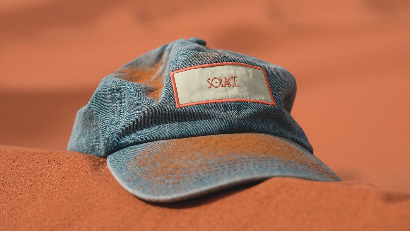
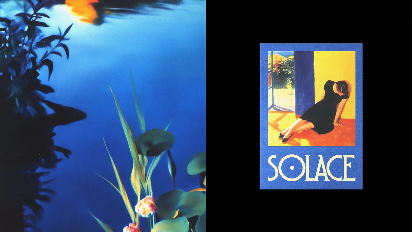
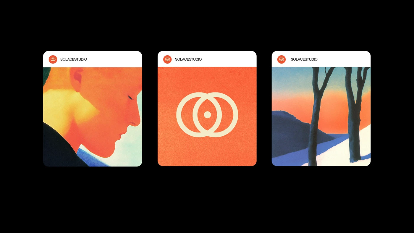
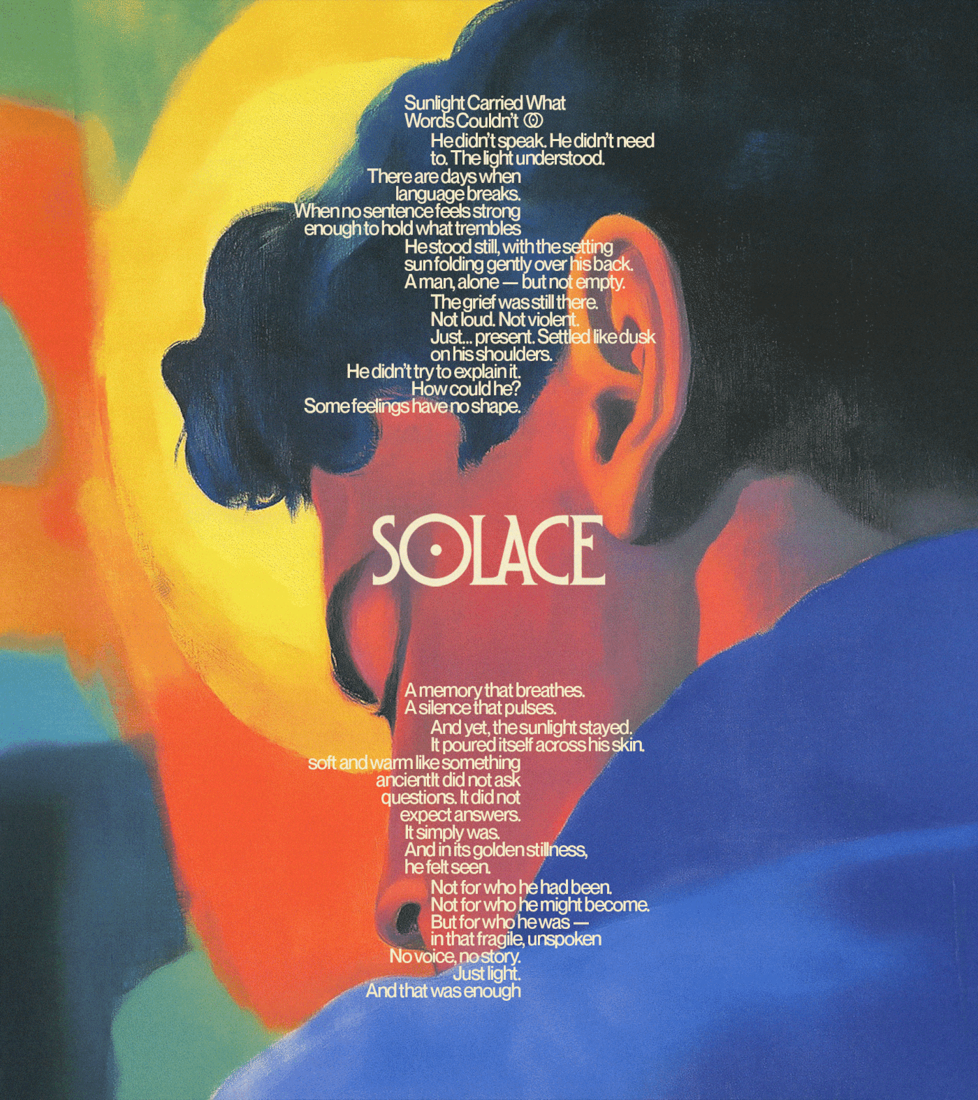
Solace Studio—a masterclass in emotional minimalism designed by Pedro Cattoni—is a refined brand identity that explores the power of restraint in modern design. Rooted in emotional minimalism, the system uses soft typography, generous spacing, and a muted palette to create a sense of calm, clarity, and quiet confidence.
Rather than relying on decorative elements, the identity leans into an editorial approach—where layout, rhythm, and negative space become the primary tools of expression. The result is a brand that feels intentional and elevated, without ever needing to overstate itself.
This project is a strong example of how contemporary branding can move beyond visual noise and instead focus on atmosphere and feeling. It demonstrates how less can truly become more when every detail is considered, and every element has room to breathe.
From a strategic perspective, Solace Studio highlights the value of designing systems, not just logos. The consistency across typography, composition, and visual pacing creates a cohesive identity that feels both modern and timeless.
For designers, studios, and brands looking to create a more refined presence, this project serves as inspiration for using simplicity as a powerful design tool—one that communicates confidence, clarity, and intention.
Fivestar Branding curates global design inspiration to showcase the best in packaging, logo design, and brand identity. Beyond curation, we are a full-service branding agency based in Ellenton, Florida and working worldwide—crafting bold, modern identities that help businesses stand out in competitive markets.


Comments