
Menin Wine
- Shane Wilson
- Sep 9, 2025
- 1 min read

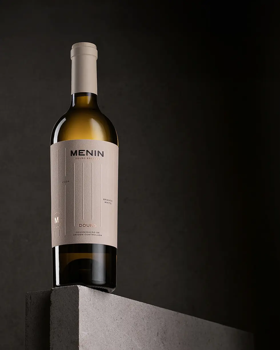
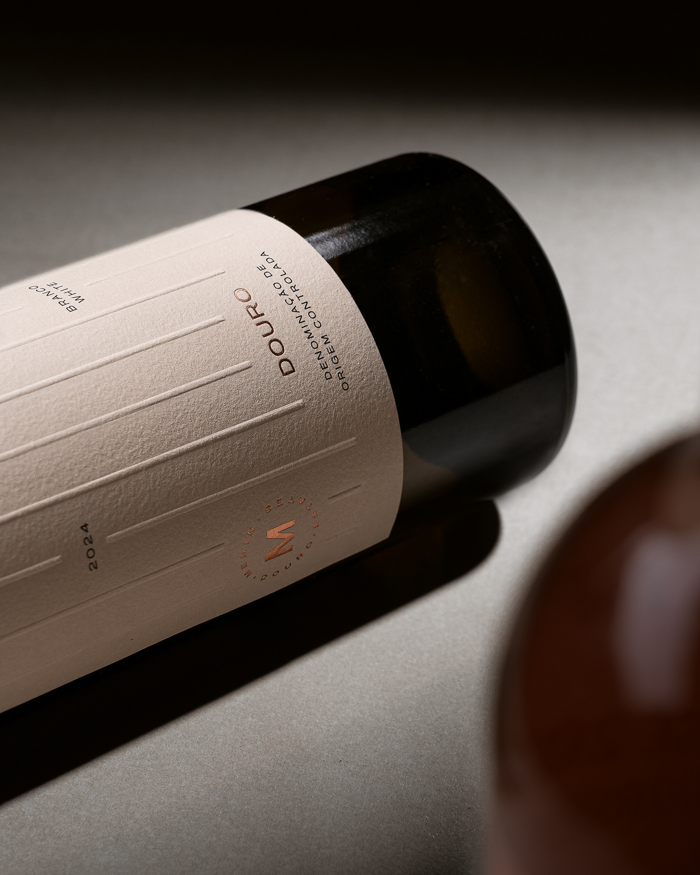
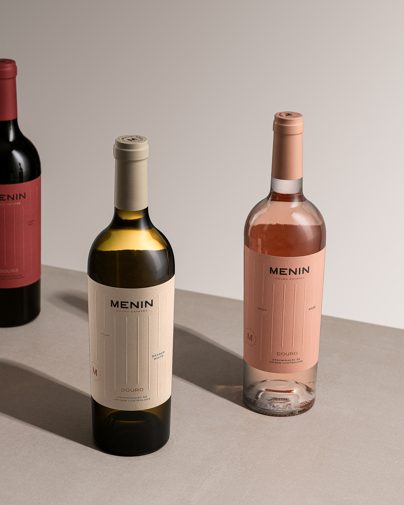
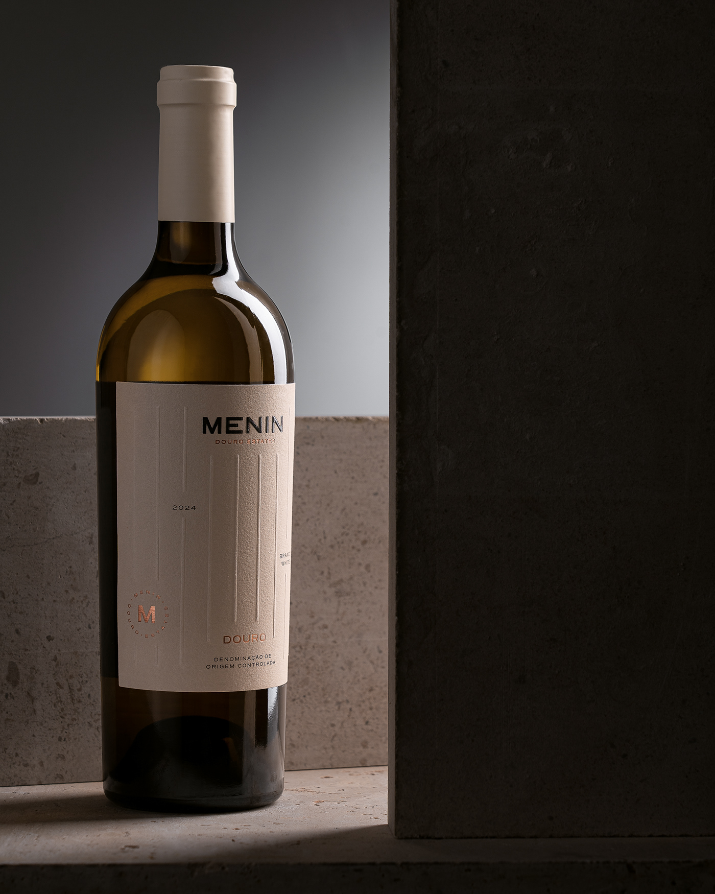
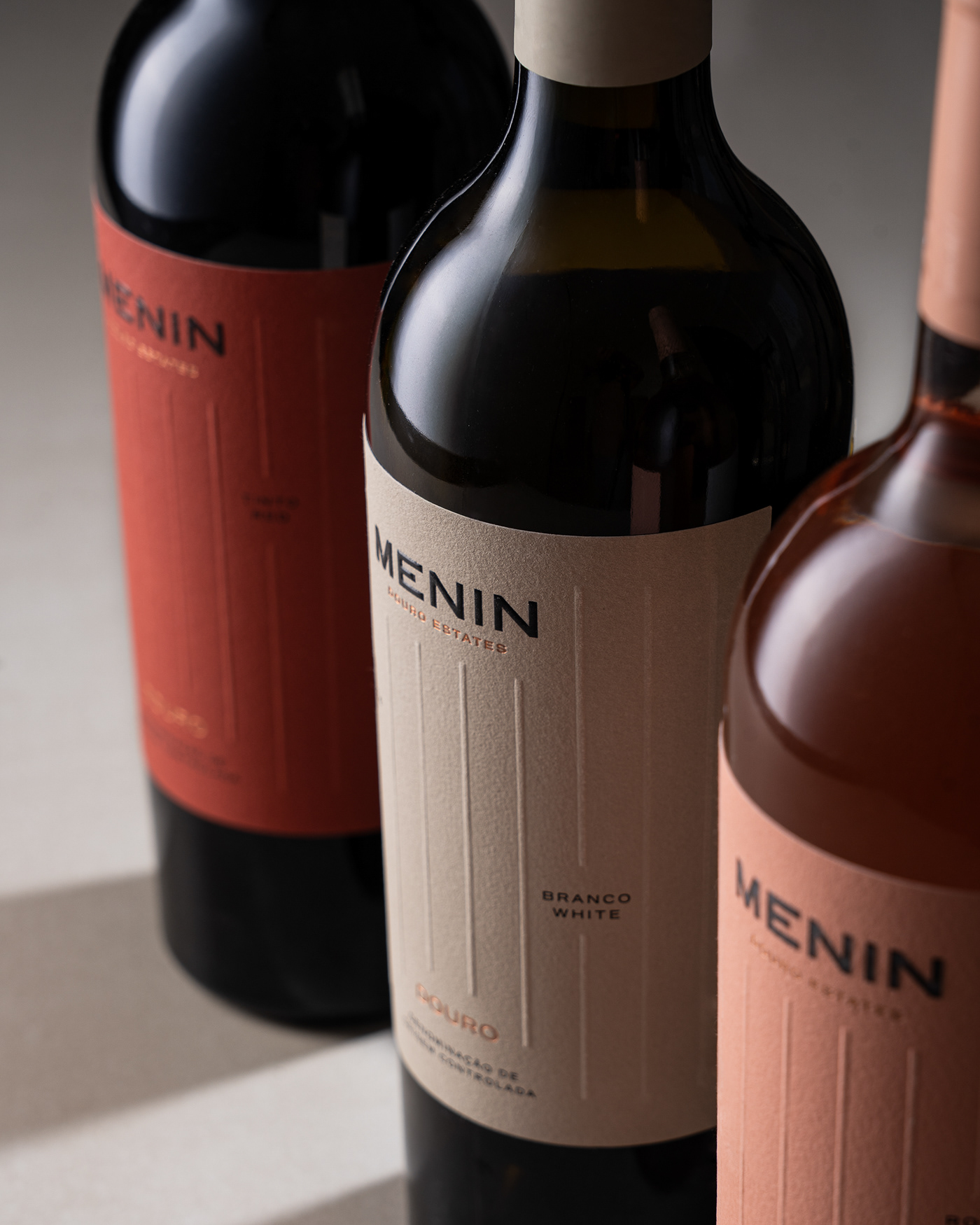
Menin Wine, a new Douro estate, partnered with Vinco Studio to bring fresh life to its identity through labels that feel as refined as the wines themselves. The updated brand leans into contemporary minimalist packaging design, with vertical embossing that recalls vineyard rows and a clean blush-and-cream palette that signals modern luxury. Copper foil accents and uncoated paper stock add a tactile richness, striking the balance between elegance and restraint. The result is a packaging system that tells a sensory story—part of the larger movement in wine branding where subtle details create lasting shelf presence. Each bottle—white, rosé, or red—carries a quiet confidence that shows how simplicity can be its own form of sophistication.

Fivestar Branding curates global design inspiration to showcase the best in logo design, packaging, and brand identity. Beyond curation, we are a full-service branding agency based in Ellenton and working worldwide—crafting bold, modern identities that help businesses stand out and thrive.


